Chapter 4 Data Visualization with ggplot2
4.1 Chapter 4 Objectives
This chapter is designed around the following learning objectives for basic data visualization in R. Upon completing this chapter, you should be able to:
- Install, load, and use
ggplot2functions to visualize dataframe elements - Differentiate between data, aesthetics, and layers in a
ggplot2object - Customize element properties such as color, size, and shape in a
ggplot2layer - Create, store, and save a
ggplot2object in an R script
4.2 Install and load ggplot2
“The best design gets out of the way between the viewer’s brain and the content.” - Edward Tufte
In this chapter, you will learn how to make basic plots using the ggplot2
package in R, which is another package in tidyverse, like dplyr and readr.
This section will focus on making useful, rather than
attractive graphs because, at this stage, we are focusing on exploring data
rather than presenting results to others. Later on, you will learn about
how to customize ggplot2 objects. Customization often helps to make plots that
“get out of the way” between the content you wish to present and the viewer’s
brain, wherein you hope understanding takes root.
If you don’t already have ggplot2 installed, you’ll need to install it. You
then need to load the package in your current session of R:
# install ggplot2 package (done once per R/RStudio installation)
install.packages("ggplot2")
# load ggplot2 in current R session
library(ggplot2)
Alternatively, if you are planning on using other tidyverse R packages in the
same R session, you can simply install and load the tidyverse “R
package suite of R packages” with library(tidyverse).
4.3 Steps to create a ggplot2 object
The process of creating a plot using ggplot2 follows conventions that are a
bit different than most of the code you’ve seen so far in R, although it is
somewhat similar to the idea of piping I introduced in the last chapter. The
basic steps behind creating a plot with ggplot2 are:
Create an object of the
ggplot2class, typically specifying the data and some or all of the aestheticsAdd a layer or geom to the plot, along with other specific elements, using
+
Aesthetics or aes() in R represent the things that we are plotting: the x
and y data. Geoms like geom_point() represent the way in which we layer
the aesthetics onto the plot. The geom is the type of plot that we are calling.
You can layer on one or many geoms and other elements to create plots that range from very simple to very customized. We will start by focusing on simple geoms and added elements; later on, we will explore more options for customization.
4.4 Initializing a ggplot2 object
The first step in creating a plot using ggplot() is to create a ggplot
object. This object will not, by itself, create a plot with anything in it.
Instead, this first step typically specifies the data frame you want to use and
which aesthetics will be mapped to certain columns of that data frame.
Aesthetics are explained more in the next subsection.
Outside of a pipeline, you can use the following conventions to initialize a
ggplot2 object:
## generic code; will not run
object <- ggplot(data = my_dataframe, aes(x = data_column_1, y = data_column_2))
The dataframe is the first parameter in a ggplot() function and, if you like,
you can use the parameter definition with that call (e.g., data = dataframe).
Aesthetics are defined within an aes() function call that is typically
defined within the ggplot() function.
While the ggplot() call is the place where you will most
often see an aes() call, you can also make calls to
aes() within the calls to specific geoms. This can be
particularly useful if you want to map aesthetics differently for
different geoms in your plot. We’ll see some examples of this use of
aes() more in later sections, when we talk about
customizing plots. The data = argument can be used in
specific geom calls to use different dataframes (from the one defined
when creating the original ggplot object), although this is
less common.
4.5 Plot aesthetics
Aesthetics are properties of the plot that can show certain elements of the
data. For example, in Figure 4.1, we call an x-axis aesthetic
(x = class) from the mpg dataset. We then plot counts of cars within
different vehicle classes using geom_bar(). The mpg dataframe is included
in the ggplot2 package; you can learn more about it by typing ?mpg (no
parentheses) into the console after loading ggplot2 with library(ggplot2).
You can also learn more by typing str(mpg) and head(mpg). As seen in
Chapters 2 and 3, one should always look at the data upon import and examine
the dataframe structure and variable classes.
According to ?mpg:
“This dataset contains a subset of the fuel economy data that the EPA makes available on http://fueleconomy.gov. It contains only models which had a new release every year between 1999 and 2008 - this was used as a proxy for the popularity of the car.”
# use ggplot() to map the data and a single aesthetic (variable = class)
ggplot(data = mpg, aes(x = class)) +
  geom_bar() # call to a specific geom to plot the mapped data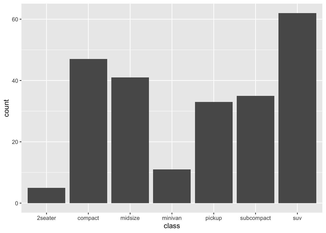
Figure 4.1: Example of a simple call to ggplot showing counts of vehicle classes from the mpg dataframe.
Let’s call this plot again with a second aesthetic, the fill color, which
will be mapped to drv, a variable in the mpg data frame that specifies
vehicle drive type (i.e., 4-wheel, font-wheel, or rear-wheel). The x-position
will continue to show vehicle class (class), but we will fill each bar
with colors pertaining to drv (i.e., to show the counts within each vehicle
class colored colored by drv).
# call to ggplot to map the data and a single aesthetic
ggplot(data = mpg, aes(x = class, fill = drv)) +
  geom_bar()  # call to a specific geom to plot the mapped data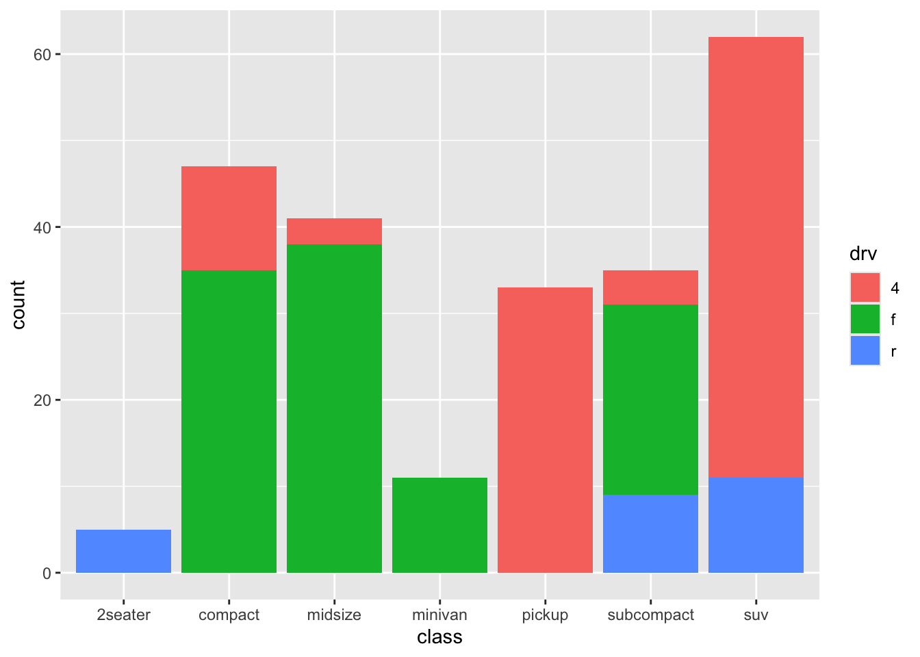
Figure 4.2: Example of a call to ggplot showing counts of vehicle classes from the mpg dataframe and colored by the fill aesthetic mapped to drive type (drv).
What new information can we learn from the Figure 4.2? For starters, we can see that compact and mid-size cars tend to be front-wheel drive, whereas pickups and SUVs (who tend to share the same chassis) tend to be 4-wheel drive. This result is not surprising to anyone who studies cars and trucks, but it’s nice to confirm one’s knowledge with quantitative data!
ggplot() will choose colors and add legends to plots
when an aesthetic mapping creates such opportunities. You will learn
ways to customize colors, legends, and other plot elements later.
Which aesthetics are required for a plot depend on which geoms (more on those
in a second) you’re adding to the plot. You can find out the aesthetics you can
use for a geom in the “Aesthetics” section of the geom’s helpfile (e.g.,
?geom_bar). Required aesthetics are often shown in bold in this section of
the helpfile. You can also view a concise summary of aesthetic specification by typing vignette("ggplot2-specs") into the R console. Common plot aesthetics you might want to specify include:
| Code | Description |
|---|---|
x |
Variable to plot on x-axis |
y |
Variable to plot on y-axis |
shape |
Shape of the element being plotted |
color |
Color of border of elements |
fill |
Color of inside of elements |
size |
Size of the element |
alpha |
Transparency (1: opaque; 0: transparent) |
linetype |
Type of line (e.g., solid, dashed) |
4.6 Adding geoms
When creating plots, you’ll often want to add more than one geom to the plot.
You can add these with + after the ggplot() statement to initialize the
ggplot2 object. Some of the most common geoms are:
| Plot type | ggplot2 function |
|---|---|
| Histogram (1 numeric variable) | geom_histogram() |
| Scatterplot (2 numeric variables) | geom_point() |
| Boxplot (1 numeric variable, possibly 1 factor variable) | geom_boxplot() |
| Line graph (2 numeric variables) | geom_line() |
A common error when writing ggplot2 code is to put the
+ to add a geom or element at the beginning of a line
rather than the end of a previous line. In this case, R will try to
execute the call too soon. If R gets to the end of a line and there is
no indication to continue the call (e.g., %>% for piping
or + for ggplot2 plots), R interprets that as
a message to run the call without reading in further code. Thus, to
avoid errors, be sure to end each line in ggplot2 calls
with +, except for the final line when the call is actually
done. Don’t start lines with +.
4.6.1 Aesthetic override: a warning
The ggplot2 package, like many tidyverse packages, is both flexible and
forgiving, designed to accommodate the user by “filling in the blanks” when no
information is provided. For example, in the ggplot() call that created
Figure 4.2, we didn’t specify the colors to be used or the
contents of the legend; instead, ggplot2 figured those out for us. The
ggplot2 package is also somewhat flexible in how calls and aesthetic
mappings can be structured. For example, the following four calls all produce
the same (identical) plot as shown in Figure 4.2. Try it for
yourself.
# call to ggplot() with aes() specified in main call
ggplot(data = mpg, aes(x = class, fill = drv)) +
geom_bar()

# call to ggplot() with aes() specified in geom
ggplot(data = mpg) +
geom_bar(aes(x = class, fill = drv))

# call to ggplot() with a mix of aes() mappings
ggplot(data = mpg, aes(x = class)) +
geom_bar(aes(fill = drv))

# call to ggplot() with all mappings in the geom
ggplot() +
geom_bar(data = mpg, aes(x = class, fill = drv))
For most plots that you make, the first example is best, where the aesthetics
are called out as arguments within the main call to ggplot(), such as:
ggplot(data = mpg, aes(x = class, fill = drv)) +
geom_bar()
In this case, the geom_bar() function inherits the aesthetics that were called
above in the main ggplot call. Specifying aesthetics in the main call to
ggplot() makes it easier to keep track of what you are trying to do!
The ggplot flexibility also comes with occasional confusion, as you can often
override one mapping with another one later on in the same call. For
example, see what happens when two different fill mappings are specified at
different points in the call:
# call to ggplot where one `fill` overrides another
ggplot(data = mpg, aes(x = class, fill = drv)) +
  geom_bar(fill = "darkgreen")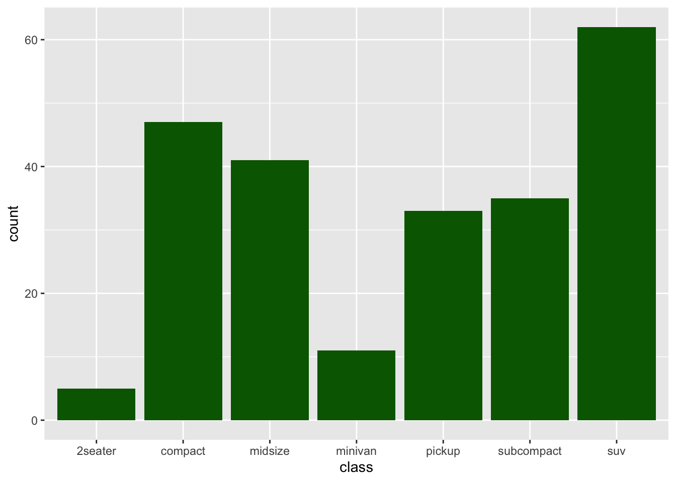
Figure 4.3: Example of a call to ggplot showing counts of vehicle classes from the mpg dataframe and colored by a fill aesthetic override.
In this case, the aesthetic mapping of aes(fill = drv) was overridden by the
specification in geom_bar(), where we wrote fill = "darkgreen". This second
specification essentially wiped away the stacked bar colors and the legend, as
shown in Figure 4.2. As your ggplot2 objects become more
customized this sort of issue can arise; it comes with the territory of having
flexible code.
4.7 Shapes and colors
In R, you can specify the shape of points with a number. Figure 4.4 shows the shapes that correspond to the numbers 1 to
25 in the shape aesthetic. This figure also provides an example of the
difference between color (black for all these example points) and fill (red for
these examples). You can see that some point shapes include a fill (21 for
example), while some are either empty (1) or solid (19).
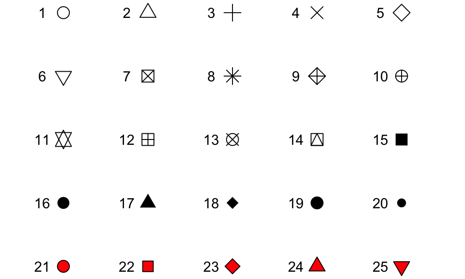
Figure 4.4: Examples of the shapes corresponding to different numeric choices for the shape aesthetic. For all examples, color is set to black and fill to red.
If you want to set color to be a constant value, you can do that in R using
character strings for different colors. Figure 4.5 gives
an example of some of the different blues available in R. To find links to
listings of different R colors, look up “R colors” and search by “Images”. Note
that colors are specified as character strings and define using quotes " ".
See the code chunk for Figure 4.3 where color is defined by
fill = "darkgreen".
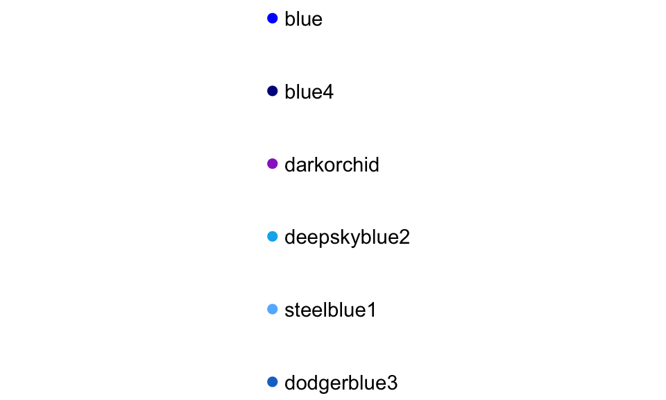
Figure 4.5: Example of available shades of blue in R.
4.8 Scales: useful plot edits
The ggplot2 package uses scales as a way to make all sorts of tweaks
and changes to how the plot is presented. According to the ggplot2
documentation:
“Scales control the details of how data values are translated to visual properties. Override the default scales to tweak details like the axis labels or legend keys, or to use a completely different translation from data to aesthetic.”
There are many scale elements that you can add onto a ggplot2 object using
+. A few that are used very frequently are:
| Element | Description |
|---|---|
ggtitle() |
Plot title |
xlab(), ylab() |
Labels for x- and y-axis |
xlim(), ylim() |
Limits of x- and y-axis |
scale_x_log10() |
Log scale of x-axis |
Note: There is also a separate R package called scales, which has various
function options to automatically detect and show breaks and labels for axes
and legends. These additional functions can be called on a ggplot object.
4.9 ggplot2 example 1
For the example plots, we will continue to use the mpg dataset from the
ggplot2 package. We will use functions from the dplyr package, too, so both
need to be loaded. Fortunately, the ggplot2 package is loaded in addition to regular tidyverse packages when you call library(tidyverse).
The first example is actually of two similar scatterplots: one using
geom_point() and one using geom_jitter(). These plots will examine the
agreement (i.e., the correlation) between a vehicle’s highway (hwy)
and city (cty) fuel economies for model year 2008.
Because the mpg dataset contains data from model year 1999 and 2008, we will
apply a dplyr::filter() command within our call to ggplot() to limit the
data to year == 2008.
We will also color the points on the plot according to the class of vehicle.
If you are wondering what types of vehicle classes are included with mpg, you
could type unique(mpg$class) or, if you want to see a quantitative summary,
you could pipe together the following:
# quantitative summary in pipe
mpg %>%
  dplyr::filter(year == 2008) %>%
  dplyr::group_by(class) %>%
  dplyr::tally() %>%
  dplyr::ungroup()
## # A tibble: 7 × 2
## class n
## <chr> <int>
## 1 2seater 3
## 2 compact 22
## 3 midsize 21
## 4 minivan 5
## 5 pickup 17
## 6 subcompact 16
## 7 suv 33# load required R packages
library(dplyr) # for data wrangling and manipulation
library(ggplot2) # for data visualization
## alternatively, use `library(tidyverse)`, if you will need multiple packages
ggplot2::ggplot() +
geom_point(data = dplyr::filter(mpg, year == 2008), # filter data
aes(x = hwy, y = cty, color = class)) # assign x, y, and color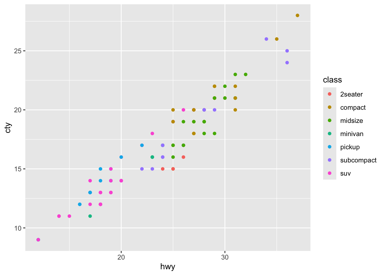
Figure 4.6: Scatterplot (geom_point) of highway vs. city fuel economy for model year 2008, colored by vehicle type
A few things to note about this plot. First, there is a clear relationship between a vehicle’s highway and city fuel economy, but the correlation is not necessarily one-to-one. Second, we can see that compact and midsize cars tend to have better fuel efficiency that pickups and SUVs (…duh). Third, in my opinion, this plot has a few drawbacks:
- If you were paying close attention, the sum of the
tally()function above reported over 100 different entries (117 to be precise), but the plot above shows only about 50 data points… Why? (Hint: if you look at thempgdata, the fuel economies are rounded to the nearest mile per gallon.)- We will address this issue with
geom_jitter()below.
- We will address this issue with
- The limits of the x- and y-axes are not equal, which distorts the relationship
a bit.
- We will address this issue with
coord_fixed()below.
- We will address this issue with
- The relationship between
ctyandhwymight be easier to distinguish if we drew a “one-to-one” line on the plot (i.e., y = x).- We will accomplish this need with
geom_ablinebelow.
- We will accomplish this need with
- Personally, I don’t like the grey background and I think that the x and y
axis labels are a little vague. I prefer my axis labels to be more
descriptive and to communicate the units being plotted.
- We will use a
theme_call to clean up the background and will specify axis labels withxlab()andylab()elements.
- We will use a
Below is the same data from Figure 4.6 plotted using
geom_jitter(). This geom is just like geom_point() except that it allows
the plotted points to contain some “jitter” (a small amount of wobble as to where
the point actually shows up in x and y space) so that overlapping data points
can be distinguished from one another. The degree of jitter is set using
height = and/or width = arguments. Note that adding jitter to data is the
same as making the plotted data less precise (in a random way) so be careful not
to add too much jitter to a plot—aim for just enough jitter so that the points
are visible without impacting the overall conclusion to be drawn from the plot.
We can also add a degree of transparency to the plotted data by
using alpha = 0.6 within the geom_jitter() layer. The alpha = argument is
available in most geoms within the ggplot2 package and allows you to set the
degree of transparency between 0 (transparent) and 1 (completely solid).
We add a one-to-one line (y = x) that communicates what perfect
agreement between variables would look like. This is accomplished using
geom_abline() (the name comes from drawing a line between points a and b on
a plot). A geom_abline() call requires us to specify a slope and an
intercept, which we will set to 1 and 0, respectively.
Finally, we clean up the plot by:
- fixing the scale of the x and y axes (i.e., ensuring that 10 units of x
distance are equal to 10 units of y distance) by specifying a
fixed coordinate system with
coord_fixed();
- adding x and y axis labels using strings as arguments to
xlab()andylab()elements; and
- setting a theme for the plot that removes the grey background using
theme_minimal().
# call to ggplot, note that data and aesthetics are called in first geom layer
ggplot2::ggplot() +
  # first geom layer (jitter)
  geom_jitter(data = dplyr::filter(mpg, year == 2008),
             aes(x = hwy, y = cty, color = class),
             width = 0.4,
             alpha = 0.6,
             size = 2) +
  # second geom layer (line)
  geom_abline(intercept = 0,
              slope = 1,
              color = "grey",
              linetype = "dashed") +
  # fix x and y coordinates to be equal in relative scale
  coord_fixed() +
  # set axis limits
  xlim(c(0,40)) +
  ylim(c(0,40)) +
  # add axis labels
  xlab("Highway Fuel Economy, mi/gal") +
  ylab("City Fuel Economy, mi/gal") +
  # adopt theme without grey background
  theme_bw()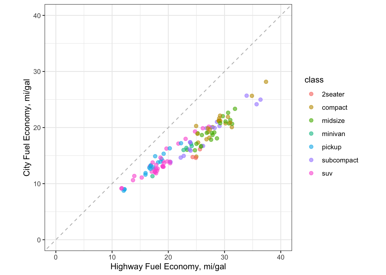
Figure 4.7: Scatterplot (geom_jitter) of highway vs. city fuel economy for model year 2008, colored by vehicle type
4.10 ggplot2 example 2
In the second example, we will look at highway fuel efficiency for SUVs in 2008,
ordered by manufacturer and colored by the engine displacement size in liters.
We create subsets of the mpg dataframe in two ways:
We create a summary dataframe (
mpg_subset) by applying twofilter()calls on thempgobject. We thengroup_by()the manufacturer so that average values for highway fuel economy (hwy_mean) and engine displacement (displ_mean) can be calculated through a call tosummarize().We subset the
mpgdataframe again, this time directly within thedata =call forggplot().
The first layer (
geom_jitter()) is a point plot that adds a slight amount of “wobble” or “jitter” to the data points so that they don’t overlap on the plot. Here, we have calledgeom_jitter()to display the individual values for 2008 SUV fuel economy on the highway as a function of manufacturer.The second layer (
geom_errorbar()) is a horizontal line plot showing the mean values for SUV models within each manufacturer. Thegeom_errorbar()function is often used to show precision (or uncertainty) about data; here we are using it to identify a single value (the mean) for each SUV manufacturer.
We also add custom labels and a color scale to investigate whether engine
displacement has an effect on fuel efficiency. Note the additional aesthetic
calls for color = in each layer. The final part of the call in
theme_classic() tells ggplot() to remove the gray background and the grid
lines, which are neither necessary nor visually appealing.
# use dplyr to create a summary subset from the `mpg` dataframe
mpg_subset <- mpg %>%
  dplyr::filter(class == "suv", year == 2008) %>%
  dplyr::group_by(manufacturer) %>%
  dplyr::summarize(hwy_mean = mean(hwy), displ_mean = mean(displ))

# call to ggplot, note that data and aesthetics are called in each geom layer
ggplot() +
  # first layer - note the main dataframe was called
  geom_point(data = filter(mpg, class == "suv" & year == 2008),
           aes(x = manufacturer,
               y = hwy,
               color = displ),
           size = 2) +
  # second layer - note the subset dataframe was called
  geom_errorbar(data = mpg_subset,
             aes(x = manufacturer,
                 ymin = hwy_mean,
                 ymax = hwy_mean,
                 color = displ_mean),
             size = 1) +
  # customize plot labels
  labs(title = "Fuel Economy for 2008 SUVs by Manufacturer and Engine Displacement",
       color = "Disp (L)") +
  ylab("highway fuel economy (miles/gal)") +
  # add a fancy color scale
  scale_colour_stepsn(colours = hcl.colors(n=5, palette = "plasma")) +
  # adopt a theme without a gray background
  theme_classic() +
  # enclose the plot on all sides with a black line
  theme(panel.background = element_rect(color = "black",
                                        size = 1))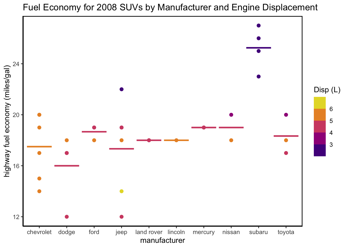
Figure 4.8: A two-layer (two geom) plot with customization
What conclusions can you draw from examining Figure 4.8? In general, model year 2008 SUVs did not have great fuel economy, evidenced by both the means and the individual data points.
4.11 Store and save ggplot2 objects
Sometimes, you will want to store a ggplot2 plot as an object in your global environment, so that it can be called or manipulated later. This is done in the same way as you would create and assign a name to any other object in R. But remember to use descriptive plot names following the naming advice from Chapter 3 (i.e., meaningful words; lowercase; underscore as separator).
In the following example, plot1 does not follow proper naming conventions!
When you create and store a ggplot() object, the plot
itself will be created and stored but not returned as output.If you want
to “see” the plot, just enter its name into the console or script, and
it will appear in the Viewer pane.
You can also save ggplot2 plots as image files to a local directory using the
ggsave() function. This function requires a file name but also allows you to
specify parameters including image resolution (dpi = 300), image type
(device = png()), and image height, width and units of measurement.
4.12 Getting help with ggplot2
The ggplot2 package has become so popular that most of my “how do I do this?”
questions have already been asked, answered, and archived on sites like
Stack Overflow.
Another great source is the
ggplot2 reference section on the tidyverse site.
This page contains a
nice, concise summary of how to call and customize plot objects. I recommend
starting there because (1) it is created and maintained by the ggplot2
developers (and, thus, is authoritative) and (2) the reference page contains
all the function calls in an organized list, for which you can conduct a
‘control/command F’ search. You can also print this RStudio ggplot2
cheat sheet
to reference while coding.
If you would like some hands-on training in ggplot2, look for tutorials or
webinars like
this one
from Dr. Samantha Tyner, the creator and maintainer
of geomnet, a ggplot2 extension. Speaking of which, the R community has
created a large number of ggplot2 extensions for different data visualization
needs. If you are thinking about a custom ggplot style, it probably
already exists! Before building your own (which is sometimes necessary and/or
fun), take a look at this
compilation of
ggplot2 extensions.
4.13 Chapter 4 Homework
You will continue to work with the ozone measurement data introduced in the previous chapter.
On Canvas, download the R Markdown template (.Rmd), which includes a description
of the data, the homework questions, and the general framework of
code-figure-text integration, including the framework for a code appendix. Save
the data and template files in your local R Project in the /data and
/homework folders, respectively. You should already have the ozone data (.csv)
saved in your /data folder.
Remember to check and set your working directory (e.g., Session > Set Working
Directory > To Source File Location) to point from the R Markdown
file and detect the data file in /data and also points to /figs as the
place to save figures and images, which is determined in the R Markdown global
option chunk I include in the R Markdown template.
This homework assignment is due at the start of the class when we begin Chapter
5. We will look for the R Markdown file and the corresponding knitted PDF or
HTML document within your /homework file. Remember, make regular, memorable
commits, so you never lose your work. Your work will be considered late if the
latest knit occurs after the deadline.