Chapter 7 Multivariate Data Exploration
7.1 Chapter 7 Objectives
This Chapter is designed around the following learning objectives. Upon completion, you should be able to:
- Understand the use and context of bivariate data
- Recognize the motivation behind a scatterplot from different perspectives
- Define correlation, causation, and the difference
- Create and interpret a scatterplot between two variables
- Leverage
ggplot2for multivariate exploratory data analysis through facets and colors
7.2 Bivariate Data
Whereas univariate data analyses are directed at “getting to know” the observations made for a single variable, bivariate—and multivariate— analyses are designed to examine the relationship that may exist between two (or more) variables. Like the Chapter on Univariate EDA, we will focus first on data exploration, which is a key step towards “getting to know” your data and one that should always proceed inferential statistics, or making conclusions about your data.
Bivariate means two variables where the observations are paired; each observation samples both variables so that they are linked.
7.3 Scatterplot
Undoubtedly, you have seen scatterplots many times before; we will discuss them in more detail here. The scatterplot allows you to assess the strength, direction, and type of relationship between two variables. This can be important for determining factors like:
- Correlation
- Linearity
- Performance (of a measurement) in terms of precision, bias, and dynamic range
Traditionally, a scatterplot shows paired observations of two variables with the dependent variable on the y-axis and the independent variable on the x-axis. Creating a plot in this way means that, before you begin, you must make a judgment call about the direction of the relationship (i.e., which variable depends on which). This relates to the scientific method and linear regression; we will discuss the latter in more detail later. For the purposes of exploratory data analysis, however, it actually doesn’t matter which variable goes on which axis. That said, since we don’t wish to break with tradition, let’s agree to follow the guidelines on independent (predictor) and dependent (outcome/response) variables. Although related, the researcher’s purpose or “mode” affects the intention behind a plot:
Scientific Method: The experimenter manipulates the control variable (independent; on x-axis) and observes the changes in the response variable (dependent; y-axis).
Statistics: The independent variable (x-axis) is thought to have some predictive ability, correlation with, or control over the dependent variable (y-axis).
Exploratory Data Analysis: We throw two variables on a plot to investigate their relationship. We make a guess about which is the independent variable (x-axis) and which is the dependent variable (y-axis), and we hope that nobody calls us out if we got it wrong…
Scatterplots are created using geom_point() by naming x = and y = variables within the aes() function.
7.3.1 Causality
All this talk about dependent and independent variables is fundamentally rooted in the practice of causal inference reasoning, which is the ability to say that “action A caused outcome B”. Discovering—or proving—that one thing caused another to happen can be incredibly powerful. Proving causality leads to Nobel Prizes, creation of new laws and regulations, judgment of guilt or innocence in court, changing human behavior and convincing human minds, and, simply put, more understanding.
A full treatment of causal inference reasoning is beyond the scope of this course, but we will, from time to time, delve into this topic. The art of data science can be a beautiful and compelling way to demonstrate causality, but we need to learn to crawl before we can walk, run, or fly. For now, let’s put aside the pursuit of causation and begin with correlation.
7.3.2 Correlation
The scatterplot is a great way to visualize whether, and, to some extent, how, two variables are related to each other.
Correlation: A mutual relationship or connection between two or more things; the process of establishing a relationship or connection between two or more measures. The variables can move up or down together or be inversely related.
Below are four examples of bivariate data (shown in scatterplots) with differing degrees of correlation: perfect, strong, moderate, and none. These are qualitative terms, of course; what is “moderate” to one person may be poor and unacceptable to another. The qualitative strength of the correlation also depends on the research context.
If you want to understand how to assess the strength of correlation quantitatively, you can explore the Pearson Correlation Coefficient (r) in the Appendix, which is used to quantify the degree of linear correlation between two variables.
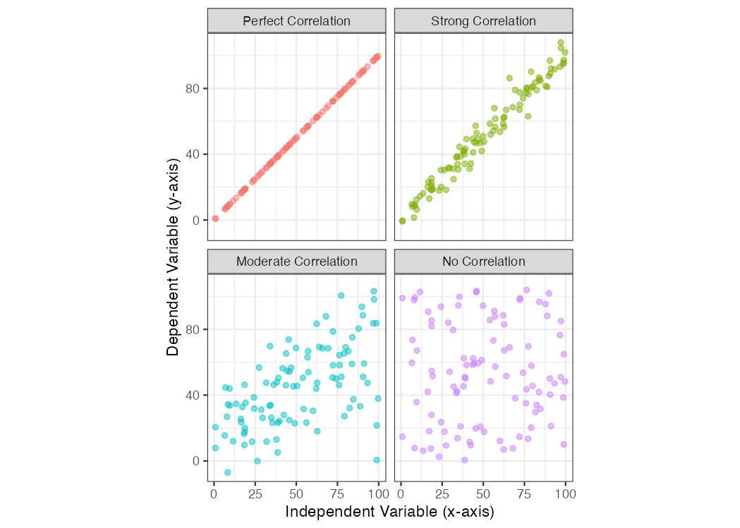
Figure 7.1: Scatterplot examples showing bivariate data with varying degrees of correlation.
In addition to the strength of the correlation, the sign and form of the correlation can vary, too:
- positive correlation: the dependent variable trends in the same direction as the independent variable; when
yincreases,xincreases, too.
- negative correlation: the dependent variable decreases when the independent variable increases
- linear correlation: the relationship between the two variables can be shown with a straight line
- non-linear correlation: the relationship between the two variables is curvilinear
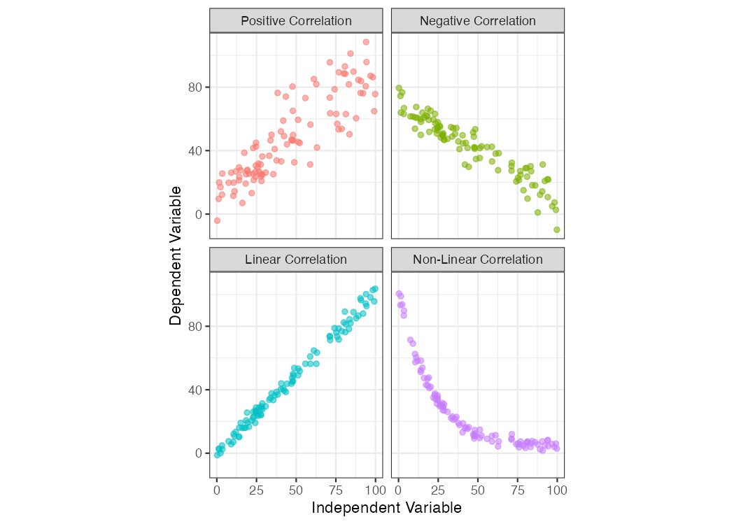
Figure 7.2: Scatterplot examples showing bivariate data with varying types of correlation.
7.3.3 Correlation \(\neq\) causation
Did you know that being a smoker is correlated with having a lighter in your pocket? Furthermore, it can be shown that keeping a lighter in your pocket is correlated with an increased risk of developing heart disease and lung cancer. Does this mean lighters in your pocket cause lung cancer?
Causation: the process or condition by which one event (cause) contributes to the occurrence of another event (effect). In this process, the cause is partly or wholly responsible for the effect.
Let’s take a closer look at the dangers of mistaking a correlated
relationship as a causal relationship between two variables. Shown below is a
scatterplot that builds off the mpg dataset we first discussed in Chapter
4. Using the mpg dataframe, we will plot the relationship
between the number of cylinders in an engine (cyl; the independent variable)
and that vehicle’s fuel economy (hwy; the dependent variable).
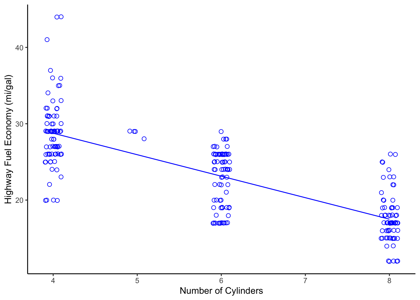
Figure 7.3: Scatterplot of Engine Displacement vs. Fuel Economy
Looking at this plot, there appears a clear correlation between the number of cylinders in a vehicle and its fuel efficiency. A linear fit through these data gives a Pearson correlation coefficient of -0.76, which is not a perfect relationship but a strong one, nonetheless. Does this mean that a causal relationship exists? If so, then we only need to mandate that all future vehicles on the road be built with 4-cylinder engines, if we want more a fuel-efficient fleet! That mandate, of course, would likely produce minimal effect. Just because two variables are correlated doesn’t mean that a change in one will cause a change in the other.
Those who understand internal combustion know that the number of cylinders is a design parameter related more to engine power than to engine efficiency. In other words, the number of cylinders helps determine total displacement volume. Indeed, the causal relationship for fuel efficiency, in terms of miles traveled per gallon, is due more directly to the energy conversion efficiency of the engine, vehicle drag coefficient, and vehicle mass. If you want more fuel-efficient cars and trucks, you need more efficient engines that weigh less. In the 1990s and early 2000s nearly all engine blocks were made from cast iron. Today, nearly all engine blocks are made from aluminum. Can you guess why?
7.4 Exploring Multivariate Data
With multivariate data, we often consider more than just two variables; however, visualizing more than two variables in a single plot can be challenging. There are advanced statistical approaches to exploring such data, including multivariate regression, principal component analysis, and machine learning approaches, but these techniques are beyond the scope of this course. Here, I will introduce a few graphical techniques that are useful for exploring multivariate data.
7.4.1 Facets
One easy way to evaluate two or more variables is to create multiple plots (or
facets) with the ggplot2::facet() function. This function creates a series of
plots, as panels, where each panel represents a different value (or level) of a
third variable of interest. For example, let’s create a ggplot object from
the mtcars data set that explores the relationship between a vehicle’s fuel
economy and its weight. First, let’s create a simple bivariate scatterplot of
these data (mpg vs. wt) and fit a linear model through the data. (Note: we
haven’t discussed modeling yet but more on that later).
# fit a linear model; the ~ means we are modeling mpg as "y" and wt as "x"
g1_model <- lm(mpg ~ wt, data = mtcars)
# create a plot, assign it to an object named `g1`
g1 <- ggplot2::ggplot(data = mtcars,
                      mapping = aes(x = wt,
                                    y = mpg)) +
  geom_point() +
  geom_smooth(model = g1_model,
              method = "lm") +
  ylab("Fuel Economy (mi/gal)") +
  xlab("Vehicle Weight (x1000 lb)") +
  theme_bw(base_size = 14)
g1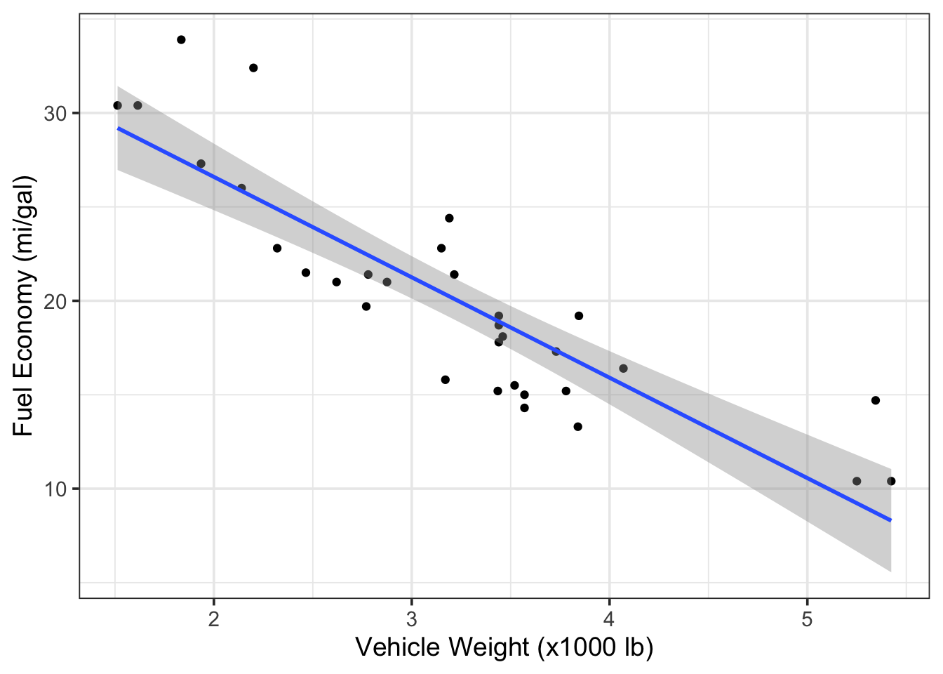
Figure 7.4: Scatterplot of fuel economy vs. vehicle weight from the mtcars dataset.
Looking back at Figure 7.3, we know that the number of
cylinders (cyl) is also associated with fuel efficiency, and many of the
vehicles from mpg have different cyl numbers. To examine these three
variables together (mpg, wt, and cyl), we can create a scatterplot that
is faceted according to the cyl variable. This is relatively easy to do in
ggplot2 by adding a facet_grid() layer onto our ggplot object. The key
details to pass to facet_grid() are:
- Whether we want to see the facets as rows or columns, and
- The variable being used to create the facets.
These two specifications can be made as a single argument to facet_grid() in
the form:
facet_grid(rows = vars(variable))orfacet_grid(cols = vars(variable)), where variable is the name of the column vector used to define the facets. Note:vars()is aggplot2::function that allows you to specify a column variable by name (instead of usingdata.frame$variable) to define the facets, similar to how we define variables in theaes()function.
In this case, seeing the plots in columns seems fine, so we would add
facet_grid(cols = vars(cyl) to the ggplot object g1 as follows:
# facet previous plot by `cyl` columns and retain labels
g1 + facet_grid(cols = vars(cyl),
                labeller = label_both) # label each panel w/ variable name & value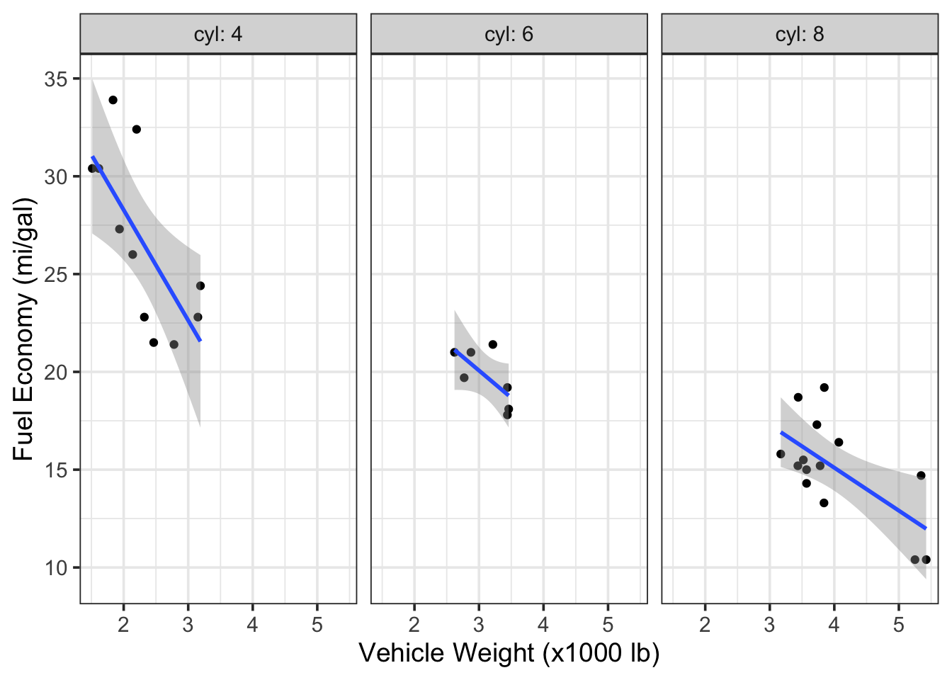
Figure 7.5: Scatterplots of fuel economy vs. vehicle weight by number of cylinders in the engine (data from the mtcars dataset).
Interestingly, but perhaps not surprising, we can see that the vehicles with
different cylinder numbers tend to have different fuel efficiency, but, even
within these facets, we still see a relationship between efficiency and vehicle
weight. Note that because the original ggplot object (g1) contained a linear model, the faceting call led to the creation of three (separate) linear models—one for each facet.
Here are the same data in a plot that is faceted by rows instead of columns. Take note how ggplot2:: allows you add the facet to the original plot object using a
+, as in: g1 + facet_grid(...)
# facet previous plot by`cyl` in rows and retain labels
g1 + facet_grid(rows = vars(cyl),
                labeller = label_both)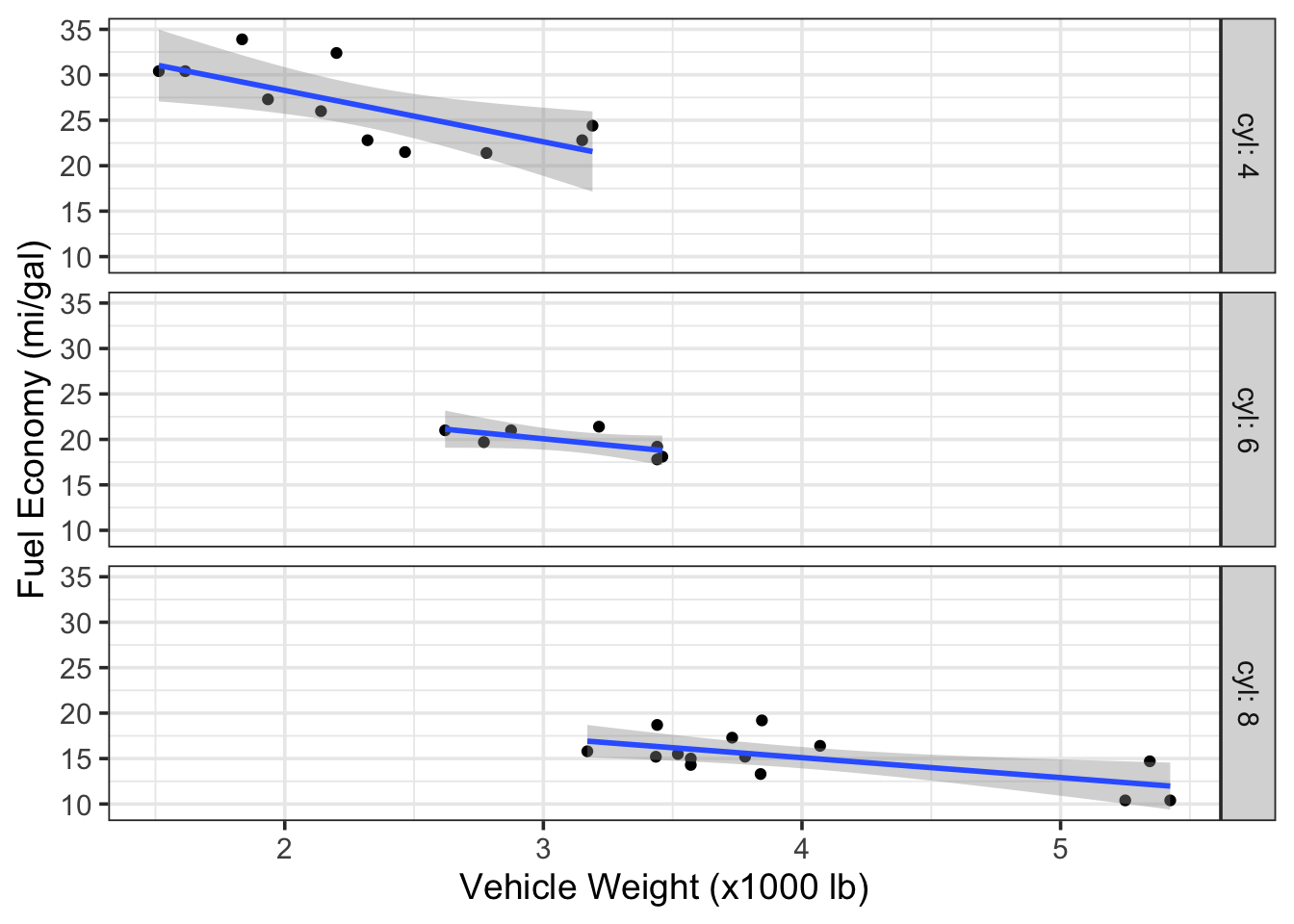
Figure 7.6: Scatterplots of fuel economy vs. vehicle weight by number of cylinders in the engine (data from the mtcars dataset).
7.4.2 Colors
We can also use color to indicate variation in data; this can be useful for
introducing a third variable into scatter, jitter, and time-series plots (or when plotting multiple boxplots, histograms, or cumulative distributions). When
introducing color as a variable into a plot, you must do so through an
aesthetic, such as geom_point(aes(color = cyl)).
Let’s recreate Figure 7.4 and highlight the cyl variable using
different colors. The addition of color provides us with the same level of
insight as the facets above.
# instruct R to treat the `cyl` variable as a factor with discrete levels
# this, in turn, tells ggplot2 to assign discrete colors to each level
# `cyl` as a factor with four levels
mtcars$cyl <- as.factor(mtcars$cyl)
# recreate previous plot with color option
g3 <- ggplot2::ggplot(data = mtcars,
                      mapping = aes(x = wt,
                           y = mpg,
                           color = cyl)) +
  geom_point() +
  ylab("Fuel Economy (mi/gal)") +
  xlab("Vehicle Weight (x1000 lb)") +
  theme_bw(base_size = 14)
# call plot
g3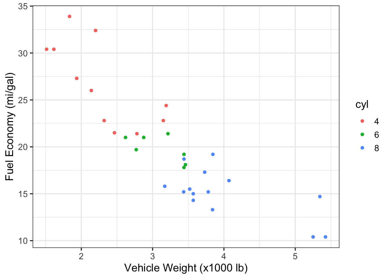
Figure 7.7: Vehicle fuel economy vs. weight and colored by number of engine cylinders (data from mtcars)
When using color, be aware that many people are unable to distinguish
red from green or blue from yellow. Many options exist to avoid issues
from color blindness (e.g., viridis palette) and websites
like color-blindness.com allow you to upload image files
so that you can see what your plot looks like to someone with color
blindness.
Here is an updated version of Figure 7.7 that avoids issues
with color blindness and, better yet, differentiates the cyl variable with
both colors and symbols.
# recreate previous plot with color-blind-friendly colors and shapes
ggplot2::ggplot(data = mtcars,
                mapping = aes(x = wt,
                              y = mpg,
                              color = cyl,
                              shape = cyl)) + # distinguish by shape also!
  geom_point(size = 2.5) +
  ylab("Fuel Economy (mi/gal)") +
  xlab("Vehicle Weight (x1000 lb)") +
  scale_colour_manual(values = c("sandybrown", # color-blind-friendly colors
                                 "orangered",
                                 "steelblue2")) +
  theme_bw(base_size = 14)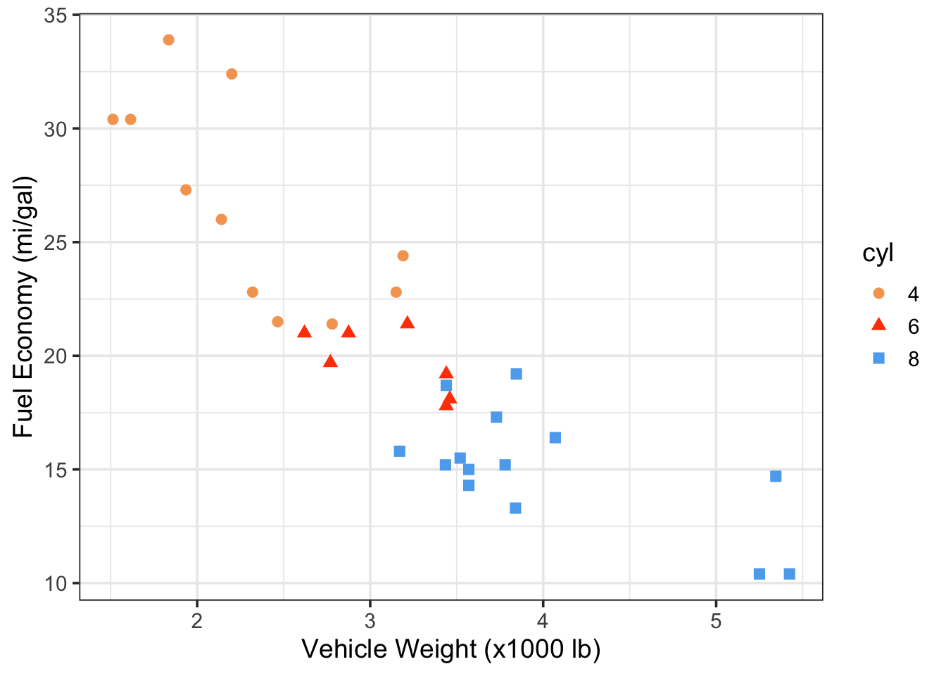
Figure 7.8: Vehicle fuel economy vs. weight and colored by number of engine cylinders (data from mtcars)
Whenever you use color to differentiate variables, it’s a good idea to use symbols, too, if possible.
7.5 Chapter 7 Exercises
7.5.1 Fuel economy data
This in-class exercise will conduct an exploratory, multivariate data
analysis on vehicle fuel economy. We will begin by downloading a .zip file from
fueleconomy.gov, which
is a Federal program that tracks the fuel economy of all vehicles sold in the
United States. The .zip file contains a .csv with fuel economy information for
nearly every vehicle manufactured between 1984 and today. We will use the
readr and dplyr packages to load and clean the data, respectively. A data
dictionary (something that defines and explains each variable in the dataset)
is also available at the website above.
7.5.2 Import and wrangle data
The first code chunk will download the data directly into a temporary file
using download.file() from base R. We will then unzip() (base R) the temp
file into a .csv and use readr to read that .csv into a dataframe named
raw_data.
# create an empty temporary object to hold the zipped data
temp <- base::tempfile()
# download the file into temp object
utils::download.file(
  url = "https://www.fueleconomy.gov/feg/epadata/vehicles.csv.zip",
  destfile = temp,
  mode="wb")
# unzip the folder within temp object to acess csv
temp2 <- utils::unzip(temp,
                      "vehicles.csv",
                      exdir = "./data/") # unzip .csv to local directory
# import csv into df object
raw_data <- readr::read_csv(temp2) #read the csv into a data frame
# delete the temp file
base::unlink(temp)
# remove the two temp objects from local environment
base::rm(temp, temp2)
Public Service Announcement: Notice the use of rm() from base R in the
above code. This is an example of a recommended use case of this function;
do not EVER use this function to “restart” your R session. If you do, Jenny
Bryan will find you and throw your computer out the window.
Looking at the raw_data dataframe, we see there are 83 variables with over
45,000 observations. That’s a LOT of vehicles! In most analyses of large
datasets, we don’t need to inspect every variable. Let’s create a vector of
variables (vars_needed) that we want to keep and pass that vector to
dplyr::select() to retain only the variables we want. To pass a character
vector as an argument to dplyr::select(), instead of just a single column
name, we use the all_of() function, which is an argument modifier from the
tidyselect R package. You can type ?tidyselect::all_of in the R console to
learn more. Essentially, tidyselect::all_of() tells dplyr::select() to
expect a character vector of column names to retain in the datset.
# create a vector of var names to retain
vars_needed <- c("id",
                 "make",
                 "model",
                 "year",
                 "cylinders",
                 "displ",
                 "drive",
                 "trany",
                 "VClass",
                 "fuelType1",
                 "comb08",
                 "highway08",
                 "city08")
# select necessary variables
df_mpg <- raw_data %>%
  dplyr::select(tidyselect::all_of(vars_needed))
# remove full dataframe from environment
rm(raw_data)
As you have seen before, some of these variables can be coded as factors,
which are categorical variables that can be classified into discrete levels.
For example, there are a finite number of vehicle transmission (trany) or
drivetrain (drive) types on the market, and, by telling R to code these data
as factors, we can analyze these variables in categorical form.
First, we will create a vector of variable names that we want to code as
factors, vars_factr. Then we will apply the as.factor() function to those
variables using dplyr::mutate(dplyr::across()). The across() function from
dplyr allows one to apply the same transformation to multiple columns in a
dataframe and is similar to how we used tidyselect::all_of() in the previous
example. We will also take the opportunity to rename a few of these variables,
following our naming guidelines discussed in earlier chapters, and to filter
the data to retain only vehicles made after the year 2000.
# identify the columns that we want to convert to a factor
vars_factr <- c("make", "drive", "trany", "VClass", "fuelType1")
# overwrite existing df
df_mpg <- df_mpg %>%
  # convert select vars to factors
  dplyr::mutate(dplyr::across(tidyselect::all_of(vars_factr),
                              .fns = as.factor)) %>%
  # overwrite column names with simpler names
  dplyr::rename(fuel_type = fuelType1,
                cyl = cylinders,
                tran = trany,
                v_class = VClass) %>% # easier string to type
  # keep only data collected after 2000 for the sake of simplicity
  dplyr::filter(year >= 2000)
# remove previous objects from global environment
rm(vars_needed, vars_factr)
7.5.3 Check data
Begin as we always do, by simply looking at some of the data.
## # A tibble: 6 × 13
##      id make  model        year   cyl displ drive tran  v_class fuel_type comb08
##   <dbl> <fct> <chr>       <dbl> <dbl> <dbl> <fct> <fct> <fct>   <fct>      <dbl>
## 1 15589 Acura NSX          2000     6   3   Rear… Auto… Two Se… Premium …     18
## 2 15590 Acura NSX          2000     6   3.2 Rear… Manu… Two Se… Premium …     18
## 3 15591 BMW   M Coupe      2000     6   3.2 Rear… Manu… Two Se… Premium …     19
## 4 15592 BMW   Z3 Coupe     2000     6   2.8 Rear… Auto… Two Se… Premium …     19
## 5 15593 BMW   Z3 Coupe     2000     6   2.8 Rear… Manu… Two Se… Premium …     19
## 6 15594 BMW   Z3 Roadster  2000     6   2.5 Rear… Auto… Two Se… Premium …     19
## # ℹ 2 more variables: highway08 <dbl>, city08 <dbl>
Next, let’s take a look at some of the factor levels. There are lots of ways
to do this in R, but the levels() function is the most straightforward.
## [1] "2-Wheel Drive"              "4-Wheel Drive"
## [3] "4-Wheel or All-Wheel Drive" "All-Wheel Drive"
## [5] "Front-Wheel Drive"          "Part-time 4-Wheel Drive"
## [7] "Rear-Wheel Drive"## [1] "Diesel" "Electricity" "Hydrogen"
## [4] "Midgrade Gasoline" "Natural Gas" "Premium Gasoline"
## [7] "Regular Gasoline"## [1] "Compact Cars" "Large Cars"
## [3] "Midsize Cars" "Midsize Station Wagons"
## [5] "Midsize-Large Station Wagons" "Minicompact Cars"
## [7] "Minivan - 2WD" "Minivan - 4WD"
## [9] "Small Pickup Trucks" "Small Pickup Trucks 2WD"
## [11] "Small Pickup Trucks 4WD" "Small Sport Utility Vehicle 2WD"
## [13] "Small Sport Utility Vehicle 4WD" "Small Station Wagons"
## [15] "Special Purpose Vehicle" "Special Purpose Vehicle 2WD"
## [17] "Special Purpose Vehicle 4WD" "Special Purpose Vehicles"
## [19] "Special Purpose Vehicles/2wd" "Special Purpose Vehicles/4wd"
## [21] "Sport Utility Vehicle - 2WD" "Sport Utility Vehicle - 4WD"
## [23] "Standard Pickup Trucks" "Standard Pickup Trucks 2WD"
## [25] "Standard Pickup Trucks 4WD" "Standard Pickup Trucks/2wd"
## [27] "Standard Sport Utility Vehicle 2WD" "Standard Sport Utility Vehicle 4WD"
## [29] "Subcompact Cars" "Two Seaters"
## [31] "Vans" "Vans Passenger"
## [33] "Vans, Cargo Type" "Vans, Passenger Type"7.5.4 Check for missing data
Next, let’s see whether this dataframe contains missing data (NAs).
## [1] 2732With a dataframe of this size, we shouldn’t be surprised that there are
2732 NA values present. The next question is: where do
these NA values show up? There are several ways to answer this question;
here, we will use the stats::complete.cases() function with a
dplyr::filter() search.
7.5.4.1 Example 1: Missing Data
The compelete.cases() function returns a logical vector indicating
which rows are complete (i.e., no missing values). The opposite of this
logical function, !complete.cases(), should return ONLY those rows that do
contain NAs. Let’s create a subset of df_mpg that only contains rows with
NA present.
## # A tibble: 1,360 × 13
##       id make   model      year   cyl displ drive tran  v_class fuel_type comb08
##    <dbl> <fct>  <chr>     <dbl> <dbl> <dbl> <fct> <fct> <fct>   <fct>      <dbl>
##  1 16423 Nissan Altra EV   2000    NA    NA <NA>  <NA>  Midsiz… Electric…     85
##  2 16424 Toyota RAV4 EV    2000    NA    NA 2-Wh… <NA>  Sport … Electric…     72
##  3 17328 Toyota RAV4 EV    2001    NA    NA 2-Wh… <NA>  Sport … Electric…     72
##  4 17329 Ford   Th!nk      2001    NA    NA <NA>  <NA>  Two Se… Electric…     65
##  5 17330 Ford   Explorer…  2001    NA    NA 2-Wh… <NA>  Sport … Electric…     39
##  6 17331 Nissan Hyper-Mi…  2001    NA    NA <NA>  <NA>  Two Se… Electric…     75
##  7 18290 Toyota RAV4 EV    2002    NA    NA 2-Wh… <NA>  Sport … Electric…     78
##  8 18291 Ford   Explorer…  2002    NA    NA 2-Wh… <NA>  Sport … Electric…     39
##  9 19296 Toyota RAV4 EV    2003    NA    NA 2-Wh… <NA>  Sport … Electric…     78
## 10 30965 Ford   Ranger P…  2001    NA    NA 2-Wh… Auto… Standa… Electric…     58
## # ℹ 1,350 more rows
## # ℹ 2 more variables: highway08 <dbl>, city08 <dbl>
Here, we discover that most of the the NA values are in the cyl, displ,
and tran, columns. Further, we see that all of these vehicles have a
fuel_type of Electricity, which makes sense because electric vehicles (EVs) do not
have internal combustion. This may be a variable level that we choose to
exclude from certain analyses later…
You might have noticed the “dot”, ., used at the end of the dplyr::filter pipe above:
df_mpg %>% filter(!complete.cases(.))
Why is there a . as an argument to a function?
We use . as a placeholder argument when more than one function is nested within a single section of pipe (%>%). The complete.cases() function requires an argument to run, so we must tell it to operate on the same dataframe on which filter() operates. The . accomplishes this need for an argument. In other words, these three lines of code are equivalent:
df_mpg %>% filter(!complete.cases(.))

df_mpg %>% filter(!complete.cases(df_mpg))

filter(df_mpg, !complete.cases(df_mpg))
Note: the . only works as a placeholder argument within a %>% call. The following code will throw an error because there is no pipe present:
7.5.4.2 Example 2: Missing Data
Filter the df_mpg data for any variables (dplyr::any_vars()) that contain
NA. Like tidyselect::all_of() that was used to clean the dataframe above,
the any_vars() function is a helper function designed for use within dplyr
and tidyr verbs.
A word to the wise: dplyr::any_vars() and similar variants
have been superseded, which means new updates are not being made to them, and
the developers will eventually encourage users to transition to using
dplyr::across(). If you are interested, take a look at this discussion thread
on the topic. You can also type vignette("colwise") into the console to introduce
yourself to the across() function. In the code below, I provide examples of the
superseded code and the more current (updated) code.
# (superseded) filter the df for rows where any of the observations contain NA
# df_mpg %>%
#  dplyr::filter_all(dplyr::any_vars(is.na(.)))

# (updated) example to filter the df for rows containing NA
df_mpg %>%
  filter(if_any(.cols = everything(),
                .fns = ~ is.na(.x)))
## # A tibble: 1,360 × 13
## id make model year cyl displ drive tran v_class fuel_type comb08
## <dbl> <fct> <chr> <dbl> <dbl> <dbl> <fct> <fct> <fct> <fct> <dbl>
## 1 16423 Nissan Altra EV 2000 NA NA <NA> <NA> Midsiz… Electric… 85
## 2 16424 Toyota RAV4 EV 2000 NA NA 2-Wh… <NA> Sport … Electric… 72
## 3 17328 Toyota RAV4 EV 2001 NA NA 2-Wh… <NA> Sport … Electric… 72
## 4 17329 Ford Th!nk 2001 NA NA <NA> <NA> Two Se… Electric… 65
## 5 17330 Ford Explorer… 2001 NA NA 2-Wh… <NA> Sport … Electric… 39
## 6 17331 Nissan Hyper-Mi… 2001 NA NA <NA> <NA> Two Se… Electric… 75
## 7 18290 Toyota RAV4 EV 2002 NA NA 2-Wh… <NA> Sport … Electric… 78
## 8 18291 Ford Explorer… 2002 NA NA 2-Wh… <NA> Sport … Electric… 39
## 9 19296 Toyota RAV4 EV 2003 NA NA 2-Wh… <NA> Sport … Electric… 78
## 10 30965 Ford Ranger P… 2001 NA NA 2-Wh… Auto… Standa… Electric… 58
## # ℹ 1,350 more rows
## # ℹ 2 more variables: highway08 <dbl>, city08 <dbl>7.5.4.3 Example 3: Missing Data
Note: In Chapter 8, you will learn to “map” the sum() and is.na() functions to each column of the data frame using map_dfc from the purrr package, which is designed to apply one ore more functions across columns of a data frame. This approach is the recommended way and I show it mainly as a preview of things to come in Chapter 8.
7.5.5 Visualize data
7.5.5.1 Tidy data
Our primary variable of interest is fuel economy, so let’s begin by visualizing
the location, dispersion, and shape of city08, highway08, and comb08,
which represent city, highway and combined fuel economy estimates. Note that
df_mpg is not in a tidy format, as fuel economy data is presented in three
different columns. We’ll fix that with tidyr::pivot_longer().
# before visualizing the data, convert to tidy format
tidy_mpg <- df_mpg %>%
  # choose simple names
  dplyr::rename(city = city08,
                hwy = highway08,
                comb = comb08) %>%
  # change data structure from wide to long
  tidyr::pivot_longer(cols = c("city", "hwy", "comb"),
                      names_to = "metric",
                      values_to = "mpg") %>%
  # switch var to factor
  dplyr::mutate(metric = as.factor(metric))
7.5.5.2 Multivariate EDA options
With the data properly tidy, we can use our basic EDA plots with stat_ecdf(),
geom_boxplot(), and geom_histogram(), to visualize the fuel economy data.
To show the different variables within the same plot, we use color =
or fill = as an extra aesthetic. All three plots are then laid out using
gridExtra::grid.arrange().
# create cumulative distribution function plot
ecdf <- ggplot2::ggplot(data = tidy_mpg,
                        mapping = aes(x = mpg,
                                      color = metric)) +
  stat_ecdf() +
  theme_bw() +
  scale_x_log10() +
  xlab(NULL) +
  ylab("Quantile")
# create boxplot
box <- ggplot2::ggplot(data = tidy_mpg,
                       mapping = aes(x = mpg,
                                     fill = metric,
                                     y = metric)) +
  geom_boxplot(outlier.alpha = 0.05) +
  theme_bw() +
  scale_x_log10() +
  xlab(NULL) +
  ylab("Metric")
# create histogram
hist <- ggplot2::ggplot(data = tidy_mpg,
                       mapping = aes(x = mpg,
                                     fill = metric)) +
  geom_histogram(bins = 35,
                 alpha = 0.75,
                 position = "stack") +
  theme_bw() +
  scale_x_log10() +
  xlab("Fuel Economy, mi/gal") +
  ylab("Counts")
# embed plots into one figure
gridExtra::grid.arrange(ecdf, box, hist,
                        widths = c(0.4,1,0.4),
                        layout_matrix = rbind(c(NA, 1, NA),
                                              c(NA, 2, NA),
                                              c(NA, 3, NA)))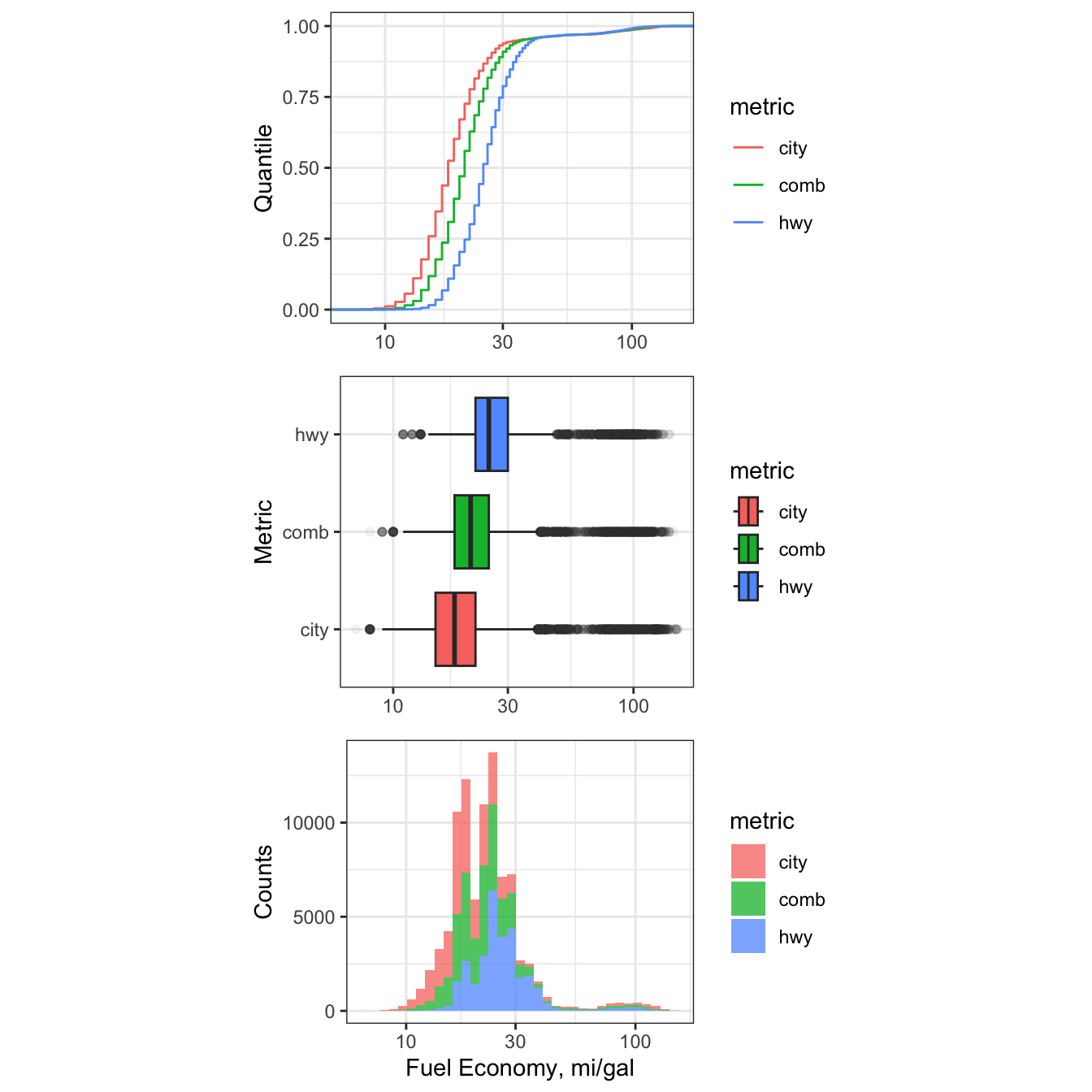
Figure 7.9: Cumulative Distribution, Histogram, and Boxplots of 21st Centurty Vehicle Fuel Efficiency.
7.5.6 Multivariate time series
Next, let’s look at a rough time series (by year) of all the combined fuel
economy values, comb08, for all vehicle observations. The fuel economy data
will be shown with boxplots, and we will use group = year as an aesthetic to
show the overall time series. We will use a log-scale y-axis due to the large
variation expected, and outliers will be made more transparent to soften their
effect.
# create time series plot
e1 <- ggplot2::ggplot(data = df_mpg,
                      mapping = aes(x = year,
                                    y = comb08)) +
  geom_boxplot(aes(group = year),
               fill = "skyblue",
               outlier.alpha = 0.1) +
  scale_y_log10(limits = c(10,150)) +
  ylab("Combined Fuel Efficiency (mi/gal)") +
  xlab("") +
  theme_bw(base_size = 14)
# call plot
e1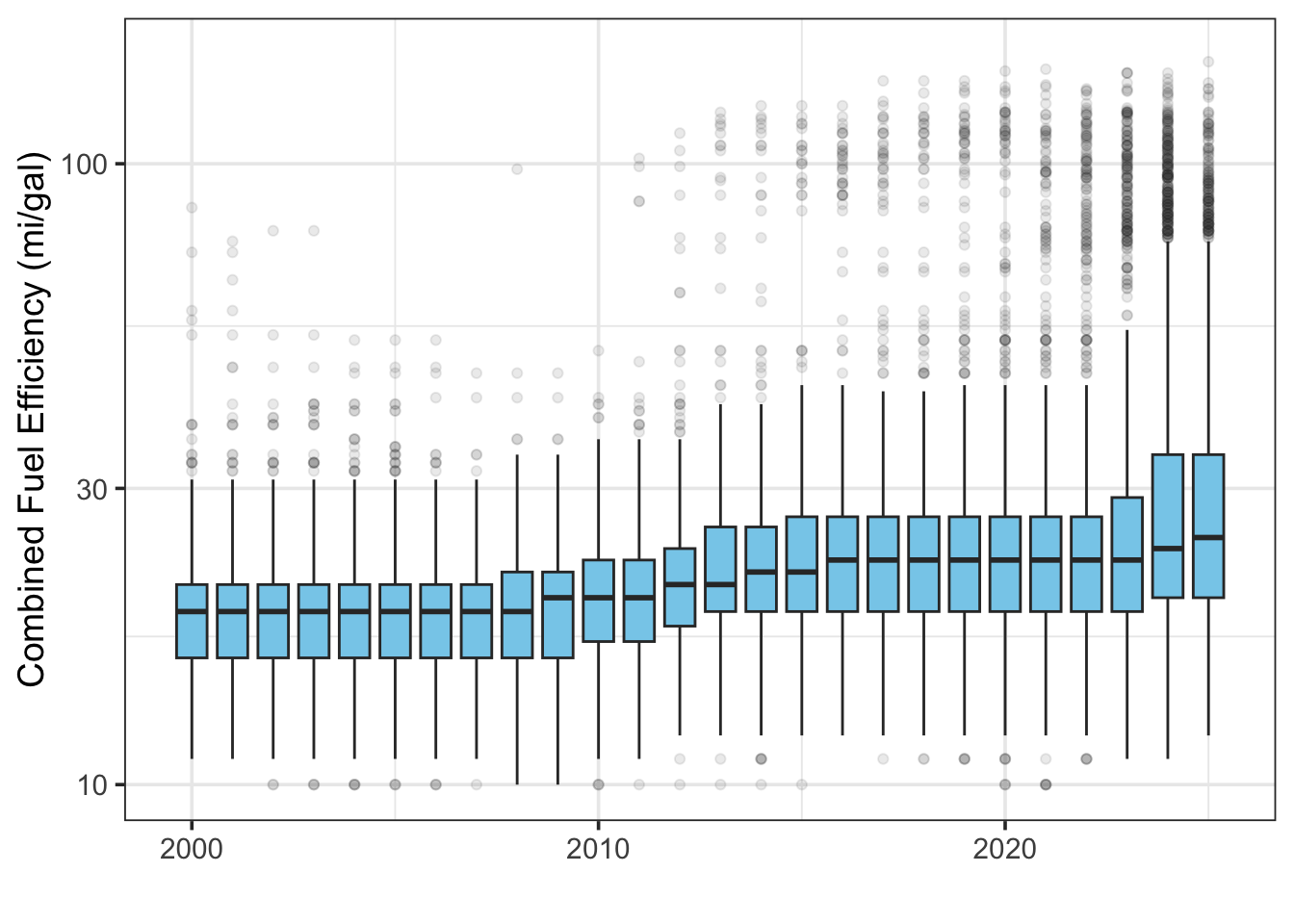
Figure 7.10: Boxplots of fleet-wide fuel efficiency by year.
7.5.6.1 Consider context
This Department of Energy website outlines
the Corporate Average Fuel Economy (CAFE) standards from the Environmental
Protection Agency that require vehicles to meet set fuel economy levels, in
terms of miles per gallon, or “mpg”, across the “fleet” of available vehicles.
Let’s load a .csv file named cafe and look at the requirements by year.
# import data
cafe <- read_csv("./data/CAFE_stds.csv", col_names = c("year", "mpg_avg"), skip = 1)
# plot cafe data
cafe.plot <- ggplot2::ggplot(data = cafe,
                    mapping = aes(group = year,
                                  y = mpg_avg,
                                  x = year)) +
  geom_col(fill = "maroon") +
  theme_bw() +
  theme(axis.text.x = element_text(angle = 90,
                                   hjust = 1)) +
  labs( y = "Required Average Fuel Efficiency (mpg)",
        x = "Year",
        title = "Federal Combined Average Fuel Economy (CAFE) Standards")
# call cafe plot
cafe.plot 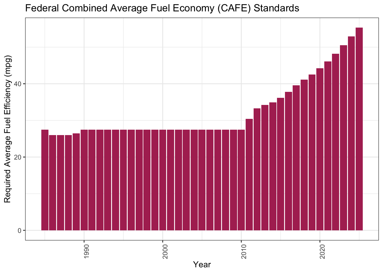
This is a nice explanatory story of why the average fuel economy numbers don’t match well to the published CAFE standards.
7.5.7 Density plots
A density plot is akin to a smoothed histogram, where the y-axis depicts the frequency (or probability of occurrence) and the x-axis represents the magnitude of the observed variable. They are called though ggplot2::geom_density and ggplot2::stat_density. Density plots are useful when you have a lot of data (typically hundreds to thousands of observations) because they allow you to visualize the shape of a distribution - namely, it’s central tendency(ies), dispersion, and skew.
Create a series of geom_density plots showing combined fuel economy comb08
across all vehicles and years as a function of fuel_type. Break out the
different fuel_type categories into facets (ncol = 3).
# density plot of combined fuel economy by fuel type with facets
g1 <- ggplot2::ggplot(data = df_mpg) +
  geom_density(aes(x = comb08, # notice the different location option for x aes
                   fill = fuel_type)) +
  facet_wrap(~ fuel_type,
             ncol = 3) +
  scale_x_log10() +
  theme_bw(base_size = 14) +
  theme(legend.position = "none")
# call plot
g1
Now show the same plot without facets.
# density plot of combined fuel economy by fuel type without facets
g2 <- ggplot2::ggplot(data = df_mpg,
                      mapping = aes(x = comb08)) + # now x aes is here
  geom_density(aes(fill = fuel_type),
               position = "identity",
               alpha = 0.6,
               adjust = 1) +
  scale_x_log10() +
  theme_bw()
# call plot
g2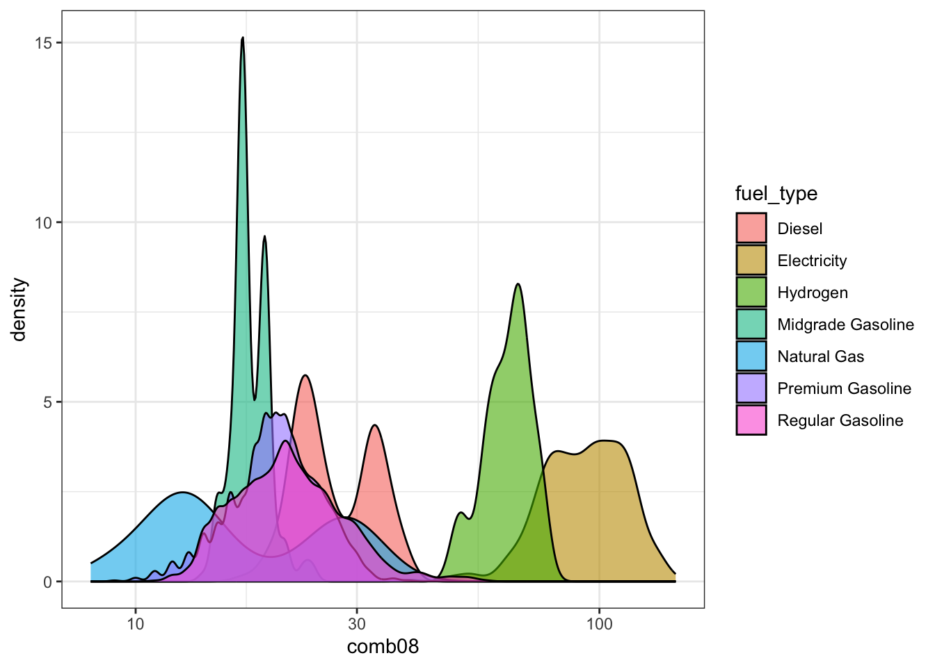
I like these plots because they lead to more questions (and that’s the point of exploratory data analysis)! Why are some of the categories bimodal? Why do many natural gas vehicles tend to have the lowest fuel efficiency? Are any of these vehicles tested on multiple fuel types? What is the most fuel efficient vehicle sold today?
7.5.8 More multivariate plotting
Next, let’s examine the effect of vehicle class on combined fuel economy for a
single year: 2023. Note, for the plot below, since vehicle class (v_class) is a factor type of variable, I can structure the plot to show v_class from lowest median efficiency to highest median efficiency (where the median is taken from each class based on the highway_08 variable). This is accomplished with the fct_reorder() function from the forcats:: package: forcats::fct_reorder(.f = v_class, .x = highway, .fun = median).
# filter to year 2023 and reorder factor levels
df_mpg.2023 <- df_mpg %>%
  dplyr::filter(year == 2023) %>%
  dplyr::mutate(v_class = forcats::fct_reorder(.f = v_class,
                                               .x = highway08,
                                               .fun = median))
# create plot of 2023 combined fuel economy
g1 <- ggplot2::ggplot(data = df_mpg.2023) +
  geom_boxplot(aes(x = highway08,
                   color = v_class,
                   y = v_class)) +
  scale_x_log10() +
  theme_bw() +
  ylab("") +
  xlab("Highway Fuel Economy") +
  theme(legend.position = "none")
# call plot
g1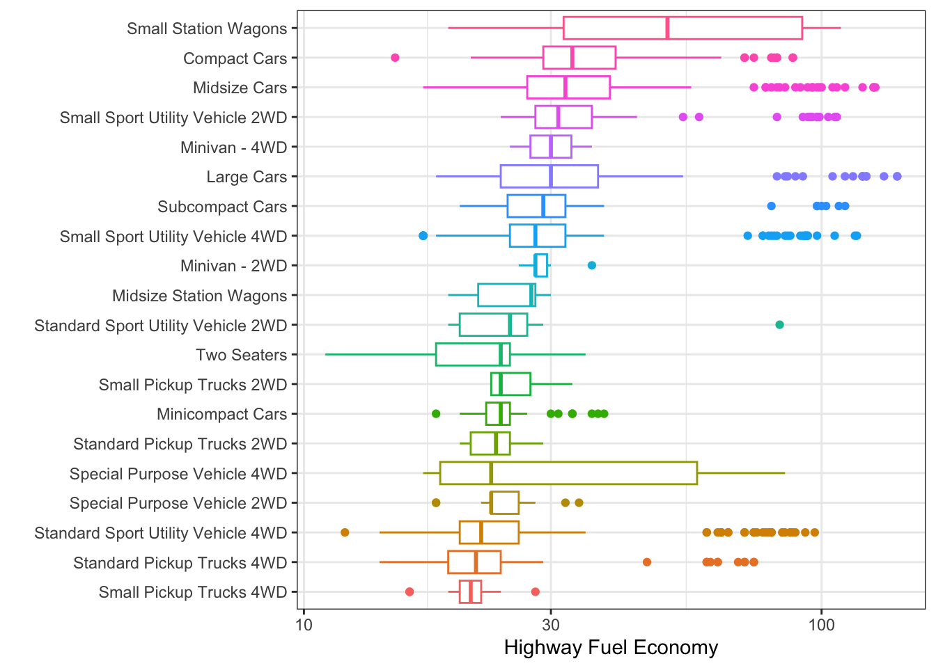
Figure 7.11: Highway Fuel Economy for 2023 Vehicles by Type
7.5.9 Practice questions
Finally, let’s ask some simple questions and use some basic data wrangling to get the answers.
Question 1
Among 4-cylinder vehicles with Front-Wheel Drive, what make/model has the best highway fuel economy in 2018?
df_mpg %>%
  dplyr::filter(cyl == 4,
                drive == "Front-Wheel Drive",
                year == 2018) %>%
  dplyr::slice_max(order_by = highway08,
                   n = 1) %>%
  dplyr::select(make, model, drive, year, highway08)
## # A tibble: 1 × 5
## make model drive year highway08
## <fct> <chr> <fct> <dbl> <dbl>
## 1 Hyundai Ioniq Blue Front-Wheel Drive 2018 59Question 2
Among 8-cylinder vehicles with Rear-Wheel Drive, what make/model has the worst city fuel economy in 2019?
df_mpg %>%
  dplyr::filter(cyl == 8,
                drive == "Rear-Wheel Drive",
                year == 2019) %>%
  dplyr::slice_min(order_by = city08) %>%
  dplyr::select(make, model, drive, year, city08)
## # A tibble: 1 × 5
## make model drive year city08
## <fct> <chr> <fct> <dbl> <dbl>
## 1 Bentley Mulsanne Rear-Wheel Drive 2019 10
Figure 7.12: The Bentley Mulsanne: $330k lets you park it on the sidewalk!
Question 3
Among 2021 vehicles from the tidy_mpg data frame, rank the highest-performing vehicle from each manufacturer in terms of fuel efficiency (mpg). Pass the search result into a table using the kable() function.
tidy_mpg %>%
  filter(year == 2021) %>%
  group_by(make) %>%
  slice_max(mpg, n =1,  with_ties = FALSE) %>%
  select(make, model, mpg) %>%
  arrange(-mpg) %>%
kable(format = "html")| make | model | mpg |
|---|---|---|
| Tesla | Model 3 Standard Range Plus RWD | 150 |
| Hyundai | Ioniq Electric | 145 |
| Chevrolet | Bolt EV | 127 |
| Kandi | K27 | 127 |
| BMW | i3s | 124 |
| Kia | Niro Electric | 123 |
| Nissan | Leaf (40 kW-hr battery pack) | 123 |
| MINI | Cooper SE Hardtop 2 door | 115 |
| Ford | Mustang Mach-E RWD California Route 1 | 108 |
| Volkswagen | ID.4 Pro | 107 |
| Polestar | 2 | 96 |
| Volvo | XC40 AWD BEV | 85 |
| Porsche | Taycan Perf Battery | 84 |
| Jaguar | I-Pace EV400 | 80 |
| Audi | e-tron | 78 |
| Toyota | Mirai XLE | 76 |
| Honda | Clarity FCV | 68 |
| Lexus | ES 300h | 44 |
| Mitsubishi | Mirage | 43 |
| Mazda | 2 | 40 |
| Mercedes-Benz | A220 | 36 |
| Subaru | Impreza 4-Door | 36 |
| Acura | ILX | 34 |
| Cadillac | CT4 | 34 |
| Lincoln | Corsair AWD PHEV | 34 |
| Alfa Romeo | Giulia | 33 |
| Ram | 1500 HFE 2WD | 33 |
| Buick | Encore GX FWD | 32 |
| Genesis | G80 RWD | 32 |
| Jeep | Renegade 2WD | 32 |
| Chrysler | 300 | 30 |
| Dodge | Challenger | 30 |
| Fiat | 500X AWD | 30 |
| GMC | Canyon 2WD | 30 |
| Infiniti | QX50 | 29 |
| Land Rover | Range Rover | 28 |
| Karma | GS-6 (21-inch wheels) | 27 |
| Bentley | Continental GT Convertible | 26 |
| Lotus | Evora GT | 26 |
| Maserati | Ghibli | 25 |
| Aston Martin | Vantage V8 | 24 |
| Ferrari | Portofino M | 23 |
| McLaren Automotive | GT | 22 |
| Rolls-Royce | Phantom | 20 |
| Roush Performance | Mustang | 19 |
| Lamborghini | Huracan | 18 |
| Bugatti | Chiron | 14 |
7.6 Chapter 7 Homework
You will continue to explore data from the National Science Foundation 2017 National Survey of Graduates, which were introduced in an earlier chapter.
From Canvas, download the R Markdown template and the reduced dataset (.csv) containing salary, age, and gender information. Your knitted submission is due at the start of the class for the exam review.