Chapter 12 Appendix: Stats & Reference Distributions
In this chapter I discuss a handful of basic statistical concepts, including several reference distributions, that you may encounter while working through this course. I don’t go into great detail on any of these topics (or their mathematical structure) because smarter, better, and more authoritative descriptions can be found elsewhere in reference texts or online. This is the $1 tour. None of the material that follows is required learning for R programming, but if you haven’t previously studied statistics (or need a refresher), it can’t hurt. The concepts outlined below, along with the discussion on quantiles in Chapter 5, form the basis for many, many data analysis techniques.
Before we delve into distributions, however, we should begin with measures of central tendency and spread, since many reference distributions have those as defining properties.
12.1 Measures of Central Tendency
When we think about a distribution of data (in a univariate sense), the central tendency represents the center, or location, of the data. The central tendency is the answer to the question: where do the values typically fall? We will use the terms mean, median, and mode to describe a distribution’s central tendency. They are defined as follows.
Let \(x\) be the variable of interest and assume that we have \(n\) observations of x stored in R as a vector. Thus, each individual observation would be \(x_{i}\) where \(i\) goes from \(1\) to \(n\). In an R programming sense, \(n =\) length(x).
- Mean: The average value, often termed as \(\bar{x}\). Calculated in
{base} Rusing themean()function.
\[\bar{x} = \frac{\sum_{i=1}^{n}x_{i}}{n}\]
Mode: The most commonly observed value for \(x\) among all the \(x_{i}\) values. The mode can be calculated using
mode()or often seen via a histogram ofx. Note that with continuous data (and precise measurements), themode()can be confusing because no two values ofxare the same…unless you group the observations into discrete bins (as is done in a histogram).Median: The 50th percentile value of \(x\) when ordered from smallest to largest value. The value of \(x_{i}\) that splits an ordered distribution of \(x\) into equal halves. The median is the same as the 0.5 quantile of \(x\). The median can be calculated directly using
median()or thequantile()function.
12.2 Measures of Dispersion
The dispersion of a univariate distribution of data refers to its variability. We will use the following terms to describe dispersion. This is not a comprehensive list by any means, but these terms are common:
Range: The range is defined by the minimum and maximum value observed for the distribution of \(x\). For a large enough sample size, the range would contain nearly ALL possible observations of the data. Lots of functions can be used to calculate the range:
range(),max()andmin(), orquantile(x, probs = c(0,1)).Inter-quartile Range (IQR): The IQR describes the variation in \(x\) needed to go from the 25th% to the 75th% of the distribution. The IQR spans the “middle part” of the distribution of \(x\) and is calculated with
IQR().Standard deviation: The standard deviation is a common measure of dispersion, but one that is easily misused, since the “standard” part of this term implies the data are normally distributed (hint: not all data are normally distributed). Still, this term is so common that one should know it. The sample standard deviation of \(x\), denoted as \(\hat{\sigma_{x}}\), is calculated in R using
sd()from the following formula:
\[\hat{\sigma_{x}} = \sqrt {\frac{\sum_{i=1}^{n}(x_{i}-\bar{x})^2}{n-1}}\]
The units of \(\hat{\sigma_{x}}\) are the same as \(x\), so we can interpret the standard deviation as a measure of dispersion about the mean. Thus, we often see \(\bar{x}\pm\hat{\sigma_{x}}\) reported for a univariate distribution.
Note: the “hat” symbol, \(\hat{}\), over the \(\sigma\) denotes that we are estimating the standard deviation based on a sample of \(x_{i}\) values. Statisticians created these hats to remind us that measurements (aka: samples, observations) are only estimates of a true population value. More on samples and populations here.
- Variance: The variance of \(x\) is the average of the squared difference from the mean for all values of \(x\). The sample variance, denoted as \(\hat{\sigma}^2\),
is also the square of the standard deviation. Variance is calculated in R using the
var()function. When we talk about variance we usually care about relative changes (i.e., “most of the variance is attributed to variable \(z\)”) because the units of variance are in terms \(x^2\), which is not easily interpreted.
\[\hat{\sigma_{x}}^{2} = \frac{\sum_{i=1}^{n}(x_{i}-\bar{x})^2}{n-1}\]
Why do we take the square of \(x_{i}-\bar{x}\) when calculating these measures of
dispersion?
Answer: Because when we are taking the sum, \(\sum_{i=1}^n\), if we didn’t calculate squares then the positive and negative deviations would cancel each other out and mislead our estimate of dispersion.
The mean and standard deviation are fine measures of central tendency and dispersion when you have data that (approximately) follow a normal distribution. When data are skewed, the mean() and sd() can lead to unexpected results. See Figure 5.8, as an example.
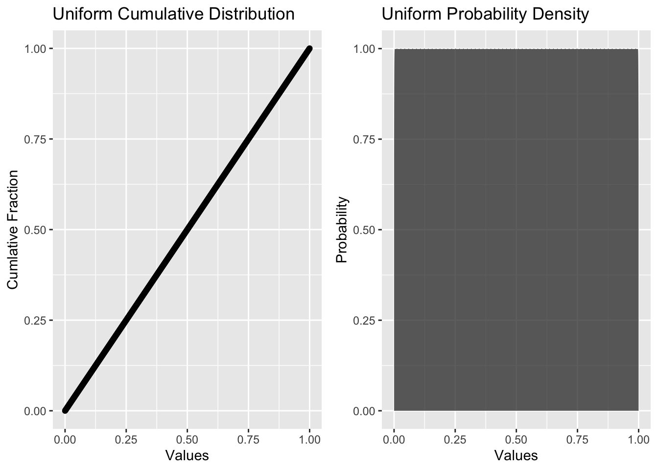
12.3 Uniform Distribution
The uniform distribution describes a situation where all obervations have an equal probability of occurrence. Examples of uniform distributions include: the outcome of a single roll of a 6-sided die, or the flip of a coin, or the chance of picking a spade, heart, diamond, or club from a well-shuffled deck of cards. In each of these cases, all potential outcomes have an equal chance of occuring. A uniform distribition may be specified simply by setting the range of possible outcomes (i.e., a minimum, maximum, and anything in between). The “in-between” part also lets you specify whether you want to allow outcome values that are continuous (like from a random-number generator), integers (like from a dice roll), or some other format (like a binary 0 or 1; heads or tails).
Below, we create a probability density function for the first roll of a six-sided die; this is a discrete uniform distribition since we only allow integers to occur. A uniform distribution is appropriate here because any of the numbers between 1 and 6 has equal probability of being rolled. Notice the shape of the histogram…flat.
#create a uniform distribition for the first roll of a 6-sided die
six_sided <- tibble(
  rolls = ceiling(runif(10e4, min=1, max=7))
)

#create a histogram of the probability density for a uniform distribution
ggplot(data = six_sided, aes(x = rolls)) +
  geom_histogram(
      breaks = seq(1,7,1),
      fill = "grey",
      color = "white") +
  xlab("Number") +
  scale_x_continuous(breaks = c(0.5, 1.5, 2.5, 3.5, 4.5, 5.5, 6.5),
                     labels = as.factor(seq(0,6,1))) +
  theme_bw(base_size = 12)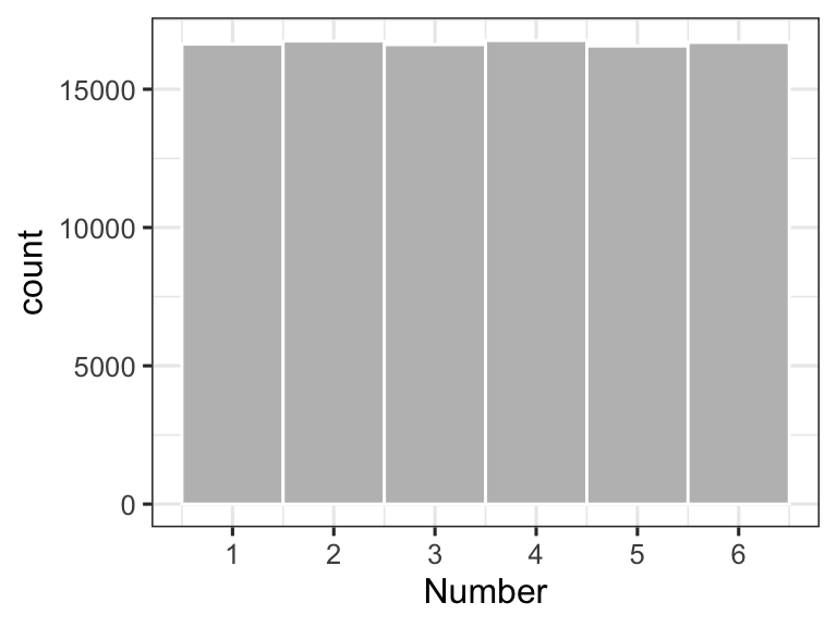
Figure 12.1: Relative counts for the first roll of a 6-sided die, rolled 100,000 times
12.4 Normal Distribution
The normal distribution arises from phenomena that tend to have additive variability. By “additive”, I mean that the outcome (or variable of interest) tends to vary in a +/- fashion from one observation to the next. Lots of things have additive variability: the heights of 1st graders, the size of pollen grains from a tree or plant, the variation in blood pressure across the population, or the average temperature in Fort Collins, CO for the month of June.
Let’s examine what additive variability looks like using the 6-sided dice mentioned above. Although a dice roll has a uniform distribution of possible outcomes (rolling a 1,2,3,4,5, or 6), the variability associated with adding up the sum of three or more dice creates a normal distribution of outcomes. If we were to roll four, 6-sided dice and sum the result (getting a value between 4 and 24 for each roll), and then repeat this experiment 10,000 times, we see the distribution shown below. The smooth line represents a fit using a normal distribution - a pretty nice fit considering that we are working with a discrete (integer-based) dataset!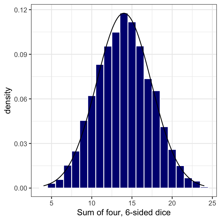
Figure 12.3: A Normal Distribution
12.4.1 Normal Characteristic Plots
Unlike the uniform distribution, the normal distribution is not specified by a range (it doesn’t have one). The normal distribution is specified by a central tendency (a most-common value) and a measure of data’s dispersion or spread (a standard deviation). A normal distribution is symmetric, meaning that the spread of the data is equal on each side of the central tendency. This symmetry also means that the mode (the most common value), the median (the 50th percentile or 0.5 quantile) and the mean (the average value) are all equal. A series of normal distributions of varying dispersion is shown in the panels below.
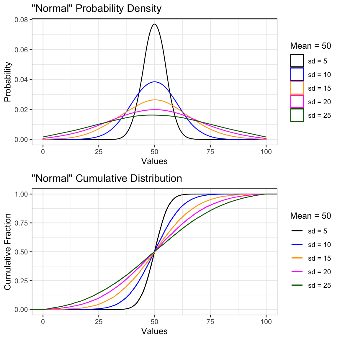
Figure 12.4: Characteristic Plots for a Normal Distribution
12.4.2 68-95-99 rule
A standard deviation for a normal distribution relates the spread of the data about the mean (and median, since they are one-in-the-same for normal data). Since we often care about the probability of occurrence for some value, whether it be a more probable value close to the mean or an extreme value close to one of the tails, the standard deviation helps tell us precisely what the odds are for getting that value, given a random sample. We use the pnorm() function to estimate these probabilities. The pnorm() function returns the probability of returning a value less than the value indicated for a given mean and standard deviation. For example, from plot in Figure 12.4 where \(\mu=50\) and \(\sigma=10\), the probability of sampling a value of 70 or less is:
## [1] 0.977The probability of sampling a value of greater than 70 is given when we set the argument lower.tail = FALSE.
## [1] 0.023That second probability is equivalent to 1 - pnorm(q = 70, mean = 50, sd =10). Try it out for yourself.
These probabilities are called “one-tailed” tests because they only occur for a single value in one direction away from the mean of the distribution (i.e., they return the probability of being within or outside one of the “tails” of the distribution).
We also define “two-tailed” tests, where we look to see if a value is likely to occur within a range (or interval) about the mean value. A two-tailed test evaluates whether we are likely to find a value within a given number of standard deviations from the mean.
Common “two-tailed” probability intervals are common knowledge for a normal distribution (read: you should be aware of them). These probabilities state that a known fraction of data are encapsulated as we move away from the mean in units of standard deviations (\(\sigma\)). This phenomenon is known as the “68-96-99 rule”:
- One standard deviation about the mean (the interval from \(\mu - 1\sigma\) to \(\mu + 1\sigma\)) contains 68.3% of the observed data.
- Two standard deviations about the mean (the interval from \(\mu - 2\sigma\) to \(\mu + 2\sigma\)) contains 95.5% of the observed data.
- Three standard deviations about the mean (\(\mu - 3\sigma\) to \(\mu + 3\sigma\)) contains 99.7% of the observed data. Figure 12.5 below depicts this rule graphically.
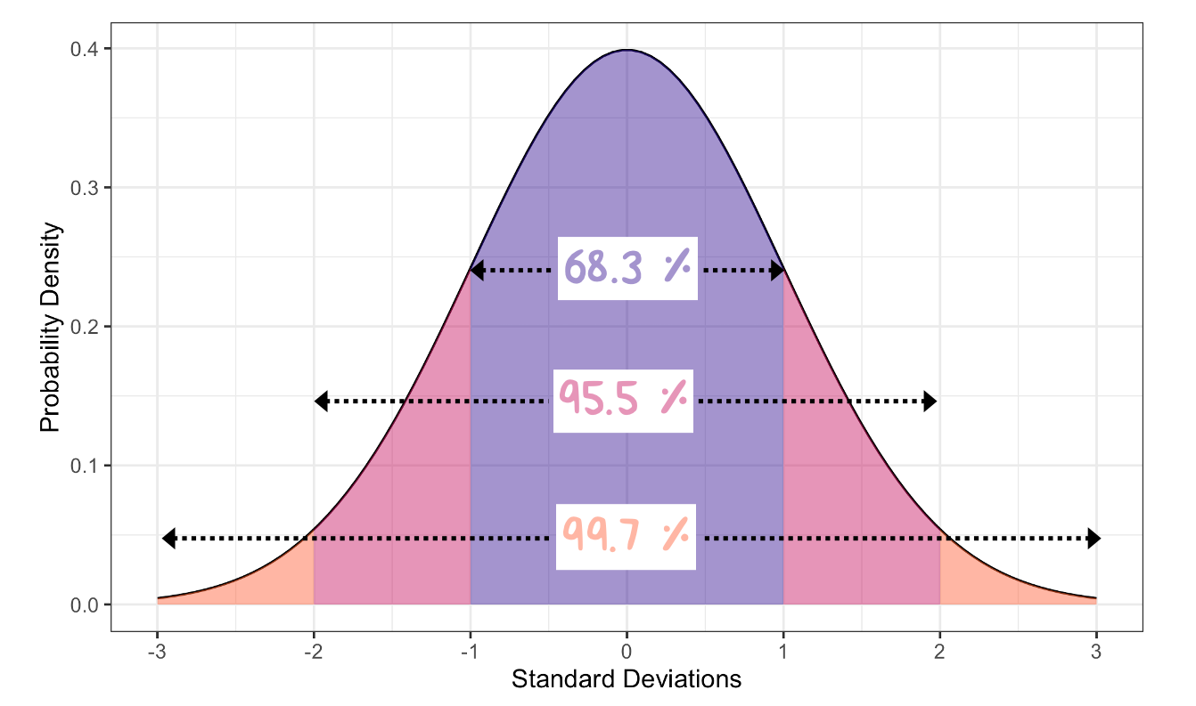
Figure 12.5: The 68-95-99 Rule for Normal Probability Distributions. Numbers represent the probability of finding a value within 1-3 standard deviations about the mean.
Inspection of Figure 12.5 indicates that the probability of encountering a value \(\pm1\sigma\) from the mean is fairly common, occurring about 32% of the time. Encountering a value \(\pm2\sigma\) from the mean, however, is rare - happening less than 5% of the time. When you hear someone refer to a “two sigma” displacement, this is likely the type of scenario they are depicting (though people rarely indicate whether they mean a one-tailed or two-tailed situation). A \(\pm3\sigma\) deviation is extremely rare, happening less than 0.3% of the time.
12.5 Log-normal Distribution
Multiplicative variation is what gives rise to a “log-normal” distribution: a special type of skewed data.
Let’s create two normal distributions for variables a and b:
#create two variables that are normally distributed
normal_data <- tibble(a = rnorm(n=1000, mean = 15, sd = 5),
                      b = rnorm(n=1000, mean = 10, sd = 3))
Individually, we know that these data are normally distributed (because we created them that way), but what does the distribution look like if we add these two variables together?
#add those variables together and you get a normal distribution
normal_data %>%
  mutate(c = a + b) -> normal_data

ggplot2::ggplot(data = normal_data) +
  geom_histogram(aes(c),
                 bins = 30,
                 fill = "navy",
                 color = "white") +
  xlab("Sum of a + b") +
  theme_minimal(base_size = 12)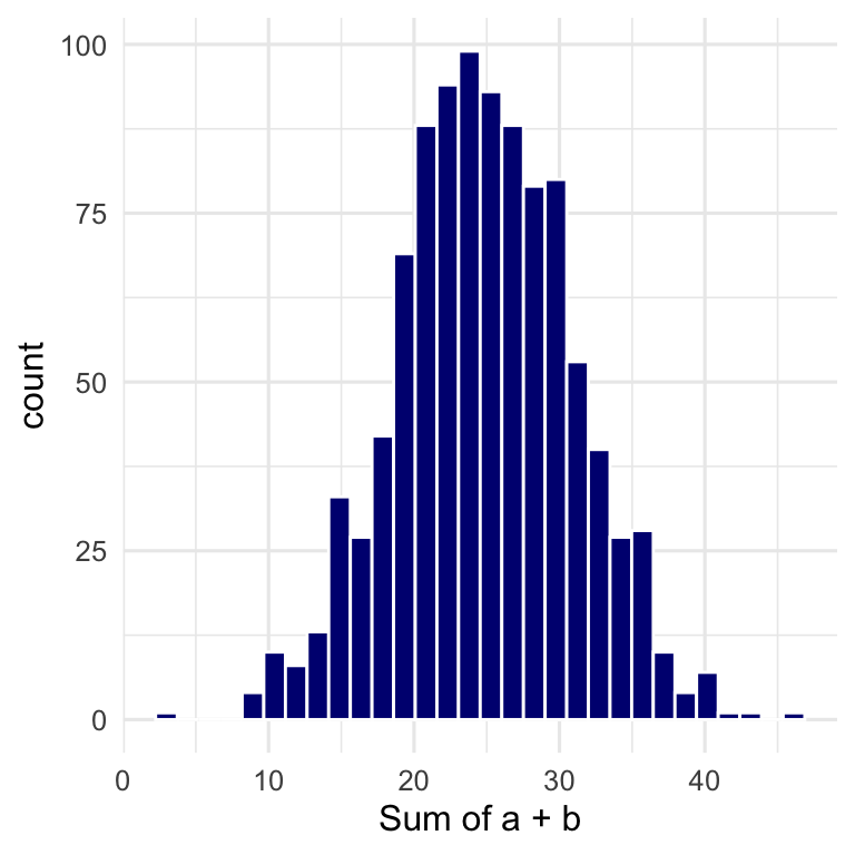
Figure 12.6: The Sum of Two Normally Distributed Variables
Answer: still normal. Since all we did here was add together two normal distributions, we simply created a third (normal) distribution with more additive variability.
What happens, however, if we randomly sample values from one or more normal distributions and multiply them together?
#multiply together three normal variables
normal_data %>%
  mutate(d = sample(a*b*c, 1000)) -> log_data

ggplot2::ggplot(data = log_data) +
  geom_histogram(aes(d),
                 bins = 30,
                 fill = "orange",
                 color = "white") +
  xlab("a * b * c") +
theme_minimal(base_size = 12) 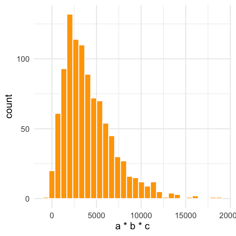
Figure 12.7: The Product of Three Normally Distributed Variables Multiplied Together
Answer: the additive variability becomes multiplicative variability, which leads to a skewed (in this case, log-normal) distribution.
Multiplicative (or log-normal) variability arises when the mechanism(s) controlling the variation of \(x\) are multipliers (or divisors) of \(x\). Many real-world phenomena create multiplicative variability in observed data: the strength of a WiFi signal at different locations within a building, the magnitude of earthquakes measured at a given position on the Earth’s surface, the size of rocks found in a section of a riverbed, or the size of particles found in air. All of these phenomena tend to be governed by multiplicative factors. In other words, all of these observations are controlled by mechanisms that suggest \(x = a\cdot b\cdot c\) not \(x = a + b + c\). Note: we provide an example of fitting a log-normal distribution in Section 9.6.4.
12.5.1 Lognormal Characteristic Plots
The lognormal distribution is called such because you observe a “normal” distribution only after taking the log of each observation, \(log(x_i)\). Similar to its normal counterpart, the lognormal distribution is characterized by a mean (\(\mu\)) and a standard deviation (\(\sigma\)), but in this case, \(\mu\) and \(\sigma\) are calculated using \(log(x_i)\). Thus, to estimate \(\mu\) and \(\sigma\) we take the log of all our observations of \(x\) and then calculate means and standard deviations of those logged values.
\[\hat{\mu} = \frac{\sum_{i=1}^{n}ln(x_{i})}{n}\]
\[\hat{\sigma} = \sqrt {\frac{\sum_{i=1}^{n}(ln(x_{i})-\hat{\mu})^2}{n-1}}\]Note that \(\mu\) and \(\sigma\) are dimensionless because they exist in log space. We normally want to communicate these variables in the same units as they exist. For that reason, we define a geometric mean as \(e^{\hat{\mu}}\) and a geometric standard deviation or GSD as \(e^\hat{\sigma}\).
Let’s take a look at a series of lognormal distributions where \(\mu\) is held constant at 0 (if \(\mu=0\) then \(e^\mu=1\)) and \(\sigma\) is varied from 0.4 to 1.1 (which means that GSD will vary from 1.5 to 3).
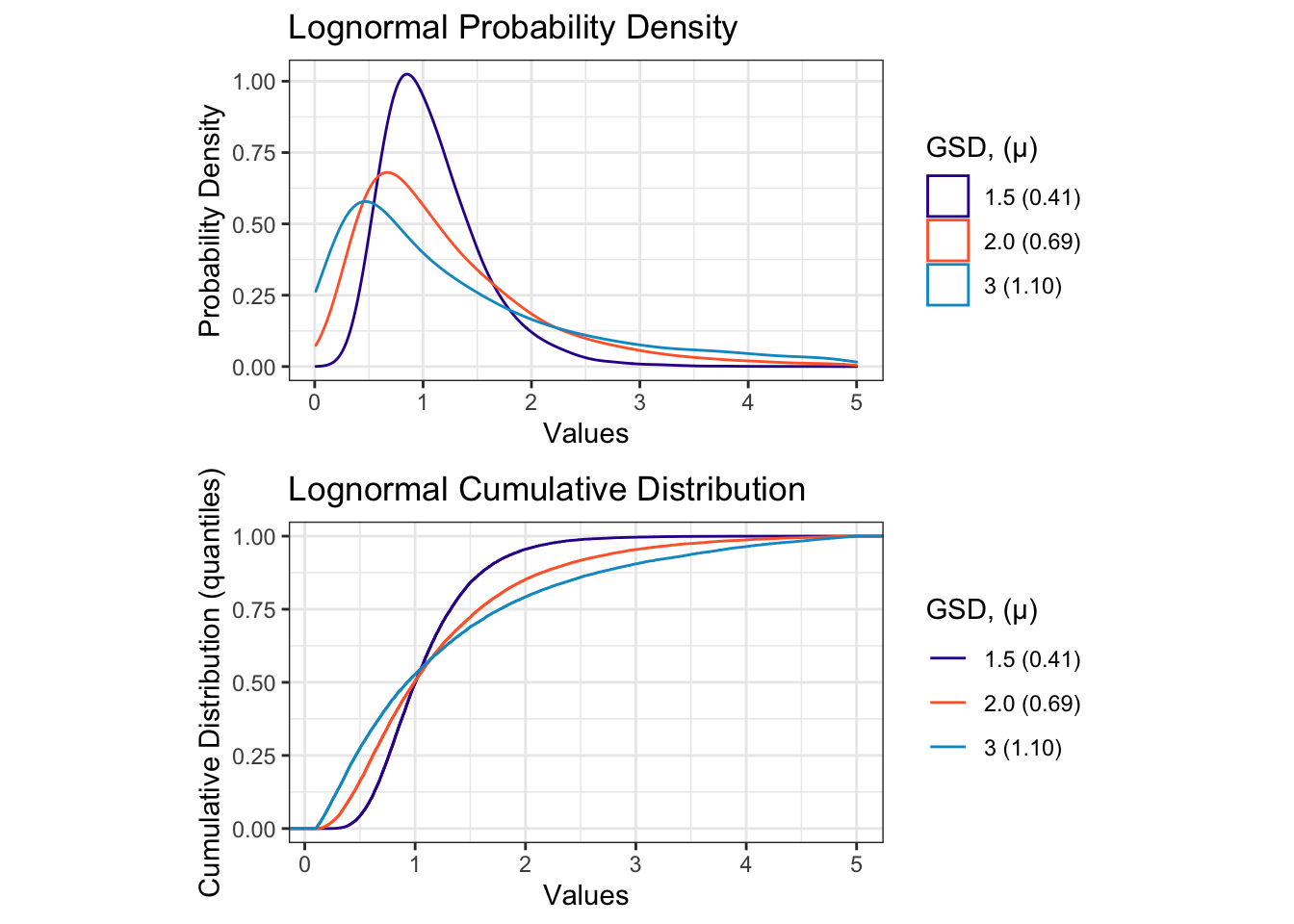
Figure 12.8: Characteristic Plots for a Series of Lognormal Distributions of Varying GSD
A key characteristic of lognormal distributions is that they are left-skewed, meaning that the plot has a tail that extends far to the right (towards increasing values). Another interesting thing about lognormal distributions is that when plotted on a log-scale axis, they look normal! Take a look at Figure 12.8 when plotted with scale_x_log10() and compare it to Figure 12.4.
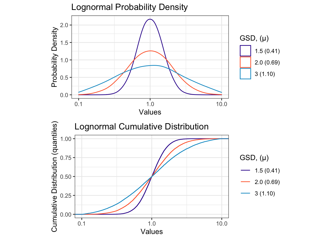
Figure 12.9: Lognormal Distributions look “normal” when plotted on a log scale axis.
The terms meanlog and sdlog represent log-space values (i.e., the data have been log transformed) - these unitless terms are used in R functions like rlnorm() and qlnorm(). The term geometric mean is presented in the units of the data (read: it’s the easiest to comprehend). The geometric standard deviation (GSD) is also unitless but different from sdlog. The GSD is a ratio of quantiles: it represents the ratio of data values at quantiles that are separated by a standard deviation: \(GSD = \frac{q_{84}}{q_{50}}\) (the 0.84 quantile divided by the 0.5 quantile). GSD can also be calculated in the other direction, \(GSD = \frac{q_{50}}{q_{16}}\), the 0.5 quantile divided by the 0.16 quantile.
12.6 Pearson Correlation Coefficient
The Pearson correlation coefficient, r, is a quantitative descriptor of the degree of linear correlation between two variables (let’s call them \(x\) and \(y\)).
The Pearson correlation coefficient indicates the proportion of linear variation in \(y\) that can be explained by knowing \(x\), when the data are paired. By “linear” we mean a straight-line fit between the two variables. The assumptions underlying the Pearson correlation coefficient are as follows:
- The variables x, y are continuous.
- Both x and y were collected as paired samples
- The dataset is free of outliers (outliers overly influence results)
- A linear relationship exists between x and y
Below, we show a series of scatter plots with varying levels of linear correlation
between two vectors:
x and y.
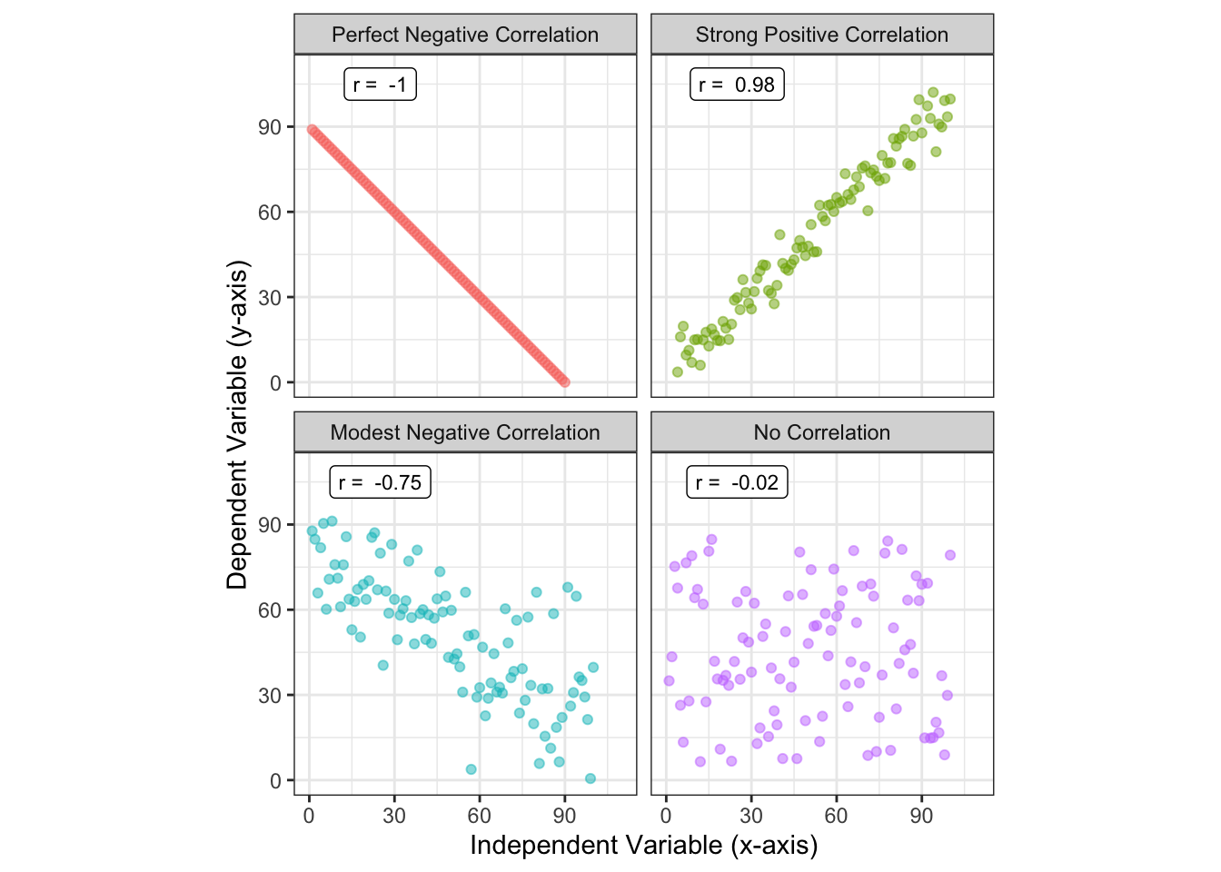
Figure 12.10: Pearson correlation for variables with perfect, strong, moderate, and no correlation.
Values of r range from -1 (perfect negative correlation) to 0 (no correlation) to 1 (perfect positive correlation). As an engineer, I would say that two variables are moderately correlated when they have a Pearson correlation coefficient (as an absolute value) \(|r|\), between 0.25 and 0.75. Two variables are strongly correlated when \(|r|>0.75\). These are qualitative judgments on my part; someone in a different discipline (like epidemiology or economics) might get super excited by discovering an r = 0.3 between two variables.
You will often see the square of Pearson correlation coefficient reported, \(r^2\). The \(r^2\) term is a direct indicator of how the variance in \(y\) is explained by knowing \(x\). Note that because of the square power, \(r^2\) values range from zero to 1.
There are several ways to calculate r - all of these are mathematically equivalent.
If we have n paired samples of x and y, then r is:
\[r = \frac{n\sum(x_{i}y_{i})-\sum x_{i} \sum y_{i} } {\sqrt {n\sum(x_{i}^{2})-\sum(x_{i})^{2}} \cdot \sqrt {n\sum(y_{i}^{2})-\sum(y_{i})^{2}}}\]
This equation looks like a lot of work but it’s really just a lot of algebra to divide the covariance of x and y with the product of their standard deviations: \(\hat{\sigma}_{x}\), \(\hat{\sigma}_{y}\).
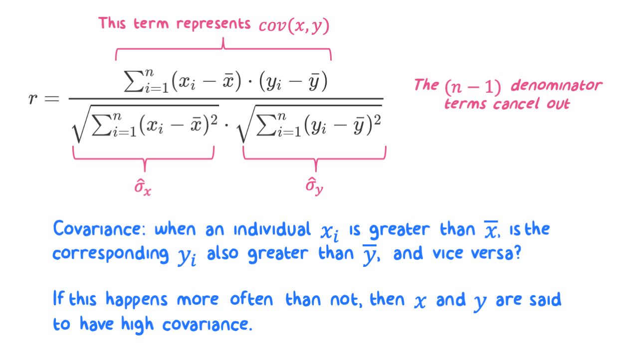
Figure 12.11: The Pearson Correlation Coefficient is not as bad as it loooks in algebraic form.
You can calculate r using the cor() function and supplying x and y as arguments. For example:
## [1] 0.8834837Also note that r is not an appropriate indicator of non-linear correlation. For example, in the example that follows, y is perfectly represented as x^4, but the Pearson correlation coefficient between these variables is not 1!
## [1] 0.8672807If you wish to quantify correlation between two variables but fear that your data violate the Pearson assumptions listed above, then try the Spearman Correlation Coefficient or Lin’s Concordance Coefficient.
12.6.1 Anscombe’s Quartet
Anscombe’s Quartet is a fabulous example of how correlation coefficients may be misinterpreted or misused. Look at the following four scatterplots below between two variables, x and y.
The data across these plots all have the same x mean and variance, y mean and variance, and the same slope, intercept, and \(r^2\) when modeled under a linear OLS regression.
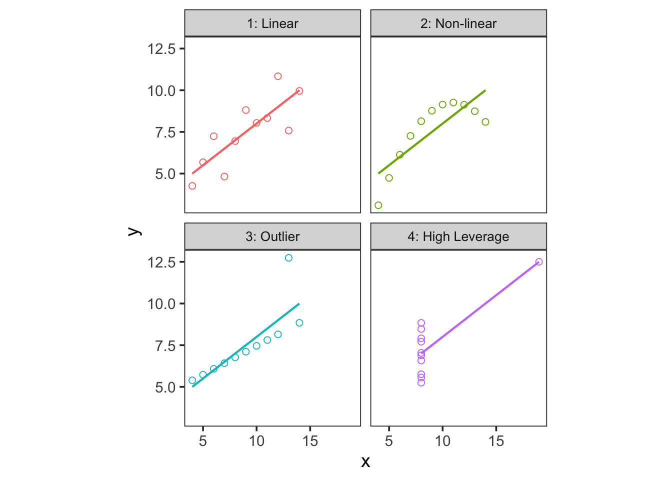
Figure 12.12: Anscombe’s Quartet. All for data sets have the same x-mean & variance, y-mean & variance, and the same slope, intercept, and correlation coefficient from an OLS linear model.
Clearly, despite similar statistics, the underlying data are from very different distributions. This example highlights why it’s so important to explore your data graphically! The top-left plot shows an imprecise linear relationship, the top-right plot shows a non-linear relationship, the bottom-left plot shows a precise linear relationship with an outlier, and the bottom-right plot shows the effect of a high-leverage point (another type of outlier) on an otherwise null relationship!
12.7 OLS Regression Coefficients
In Chapter 11 we discuss how to create a simple linear model (regression) between two observed variables \(X\) and \(Y\). Here, we present the math behind an OLS linear fit, where the goal is to estimate model coefficients for the intercept (\(\beta_{0}\)) and slope (\(\beta_{1}\)) of the line between \(Y\) and \(X\) such that:
\[Y = \beta_{0} + \beta_{1}\cdot X + \epsilon\]
where the last term, \(\epsilon\), represents the model error, or residual.
To calculate the slope term, \(\beta_{1}\), we multiply the Pearson correlation coefficient (i.e., cor(x, y)) by the ratio of the standard deviations for \(Y\) and \(X\) (i.e., sd(y)/sd(x)):
\[\beta_{1} = r\cdot\frac{\hat\sigma_y}{\hat\sigma_x}\]
This is mathematically equivalent to taking the ratio of the covariance between \(X,Y\) to the variance of \(X\):
\[\beta_{1} = \frac{cov(x,y)}{var(x)} = \frac{\sum_{i=1}^{n}(x_{i} - \bar{x})\cdot(y_{i} - \bar{y})}{\sum_{i=1}^{n}(x_{i}-\bar{x})^2}\]
Once we know the slope term (\(\beta_{1}\)) we calculate the intercept (\(\beta_{0}\)) using \(\beta_{1}\) and the sample means:
\[\beta_{0} =\bar{Y} - (\beta_{1}\cdot \bar{X})\]